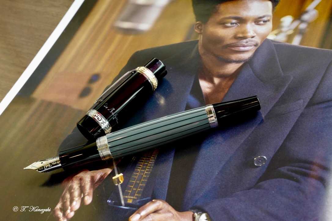
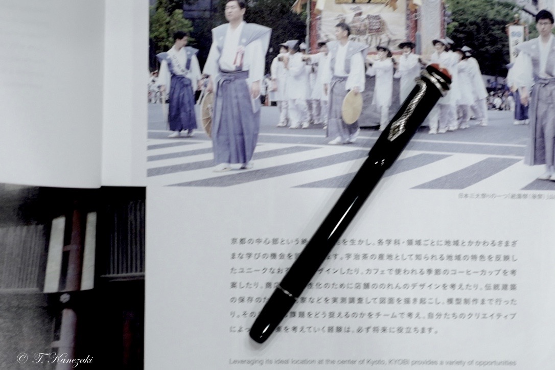
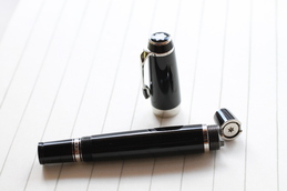
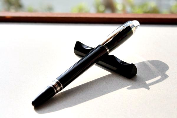
Montblanc Writers Edition 2000 Friedrich Schiller
- Friedrich Schiller -
Friedrich Schiller dedicated all his literary and dramatic talent to a central theme: freedom. The success of pieces such as "The Robbers", "Mary Stuart", "William Tell" and "Wallenstein" shows how precisely Schiller captured the spirit of a century of revolution and radical change, again and again. His works, at whose center is always a strong call for freedom, and revolt against individual constraints, still inspire people all around the world.
As a timeless figure in the theater of the Enlightenment, Schiller was not only a master of complex drama but also a prominent supporter of his age's striving for freedom. When Schiller died, his life-long friend Goethe said that half of his own life had died with him.
- Limited Fountain Pen -
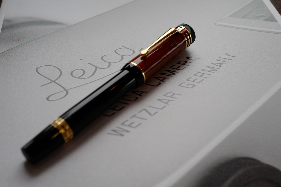
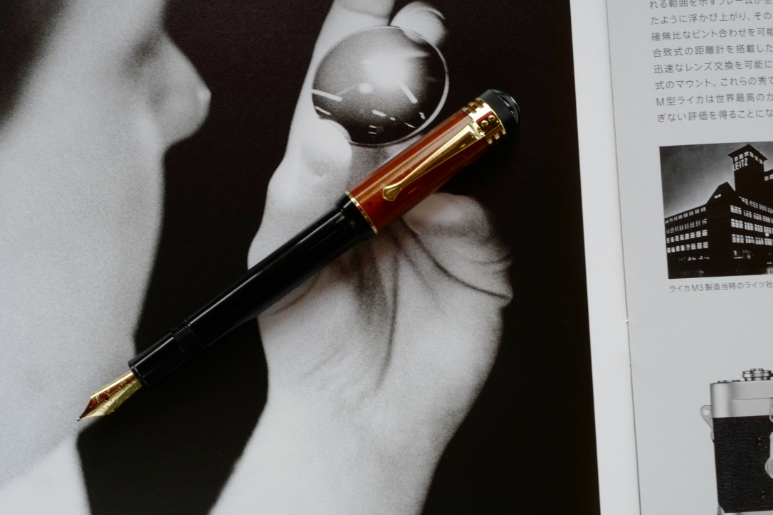
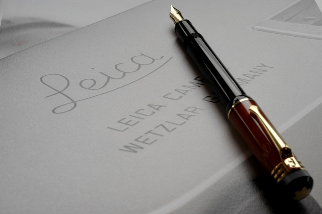
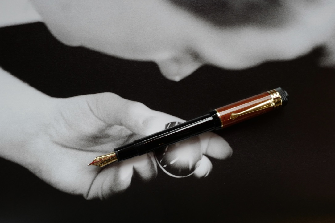
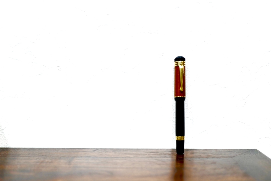
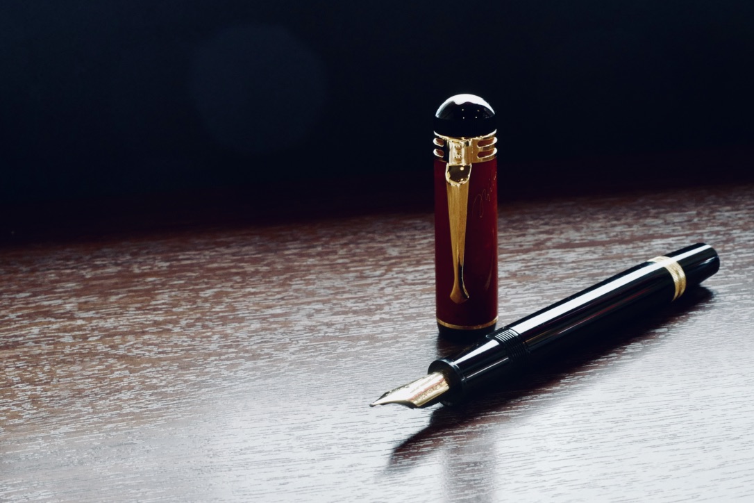
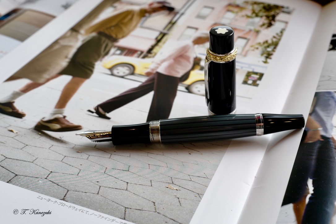
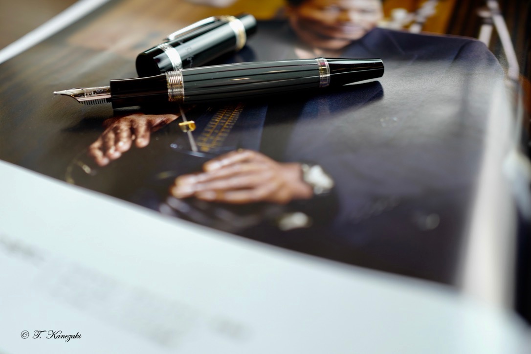
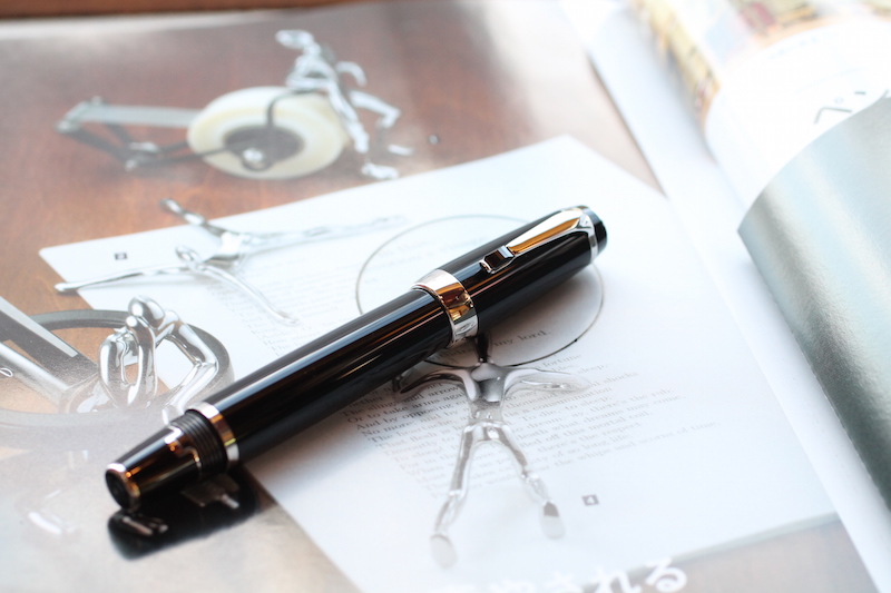
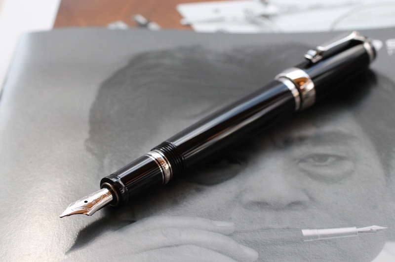
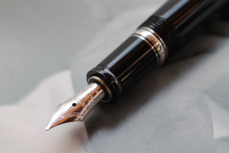
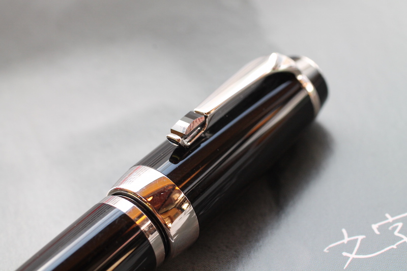
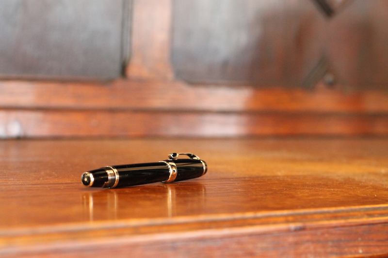
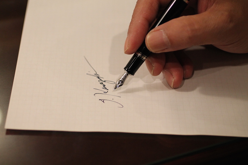
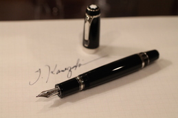
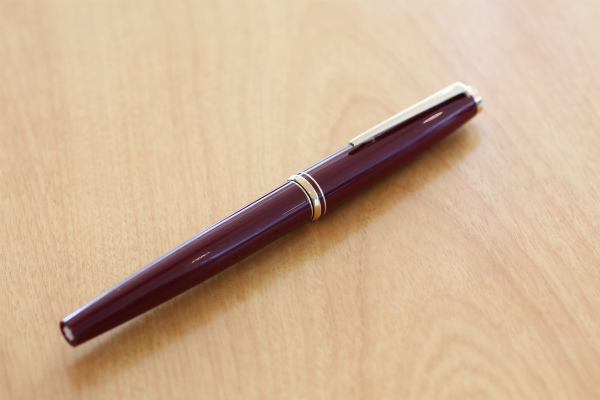
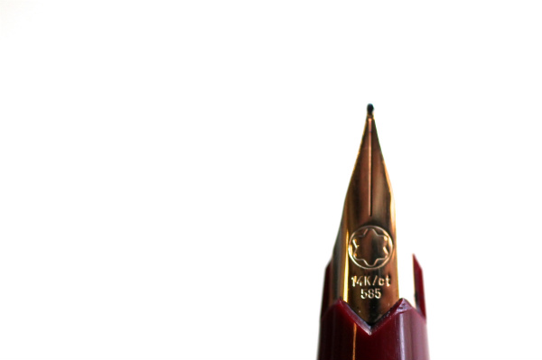
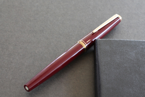
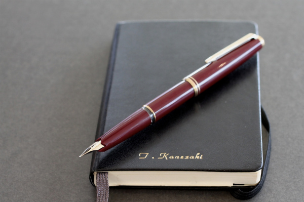
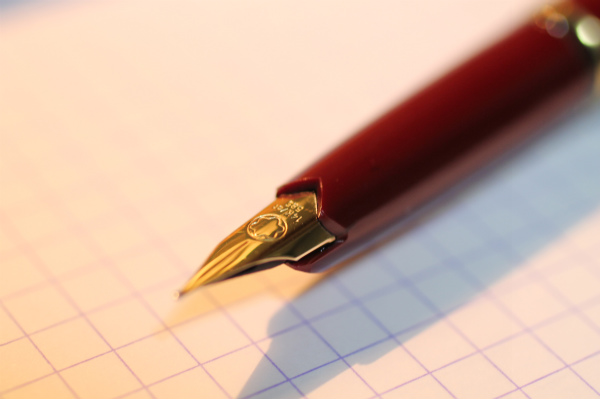
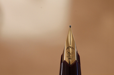
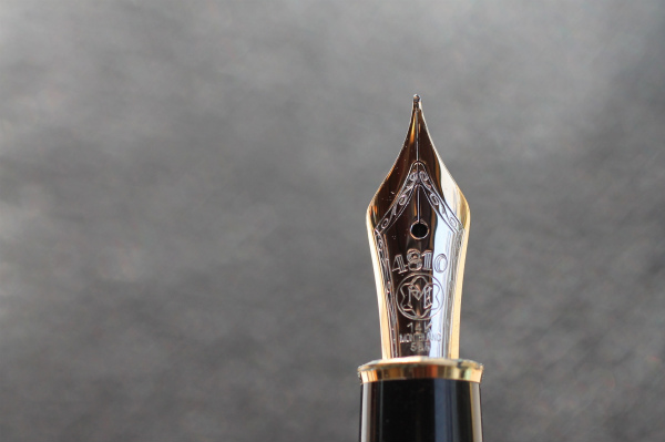
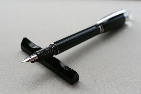
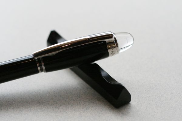
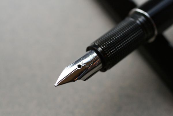
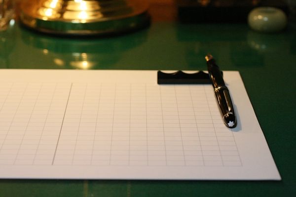
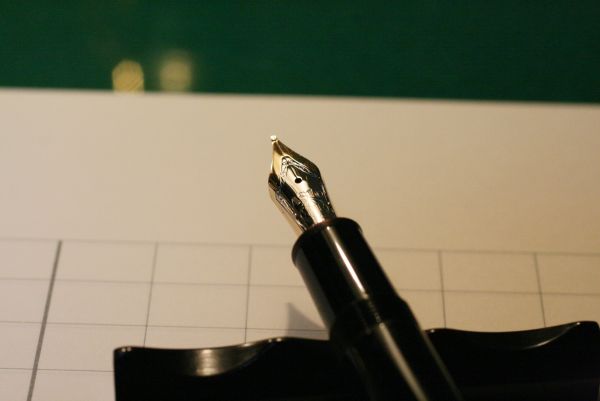
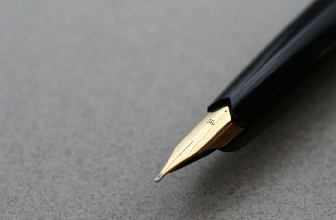
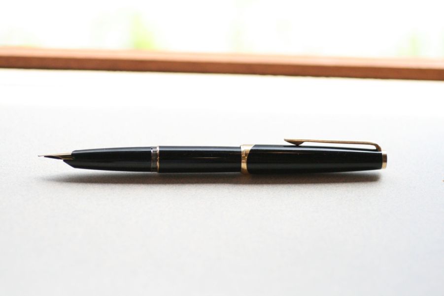
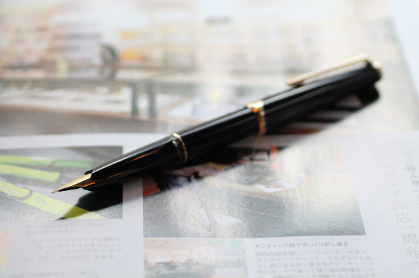
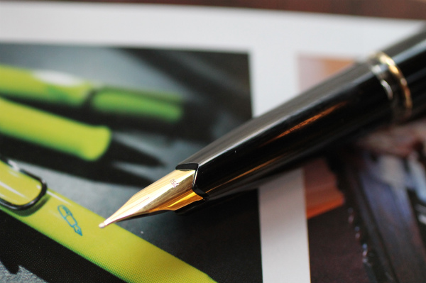
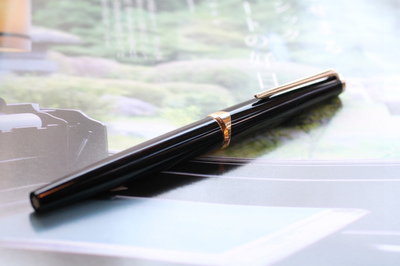
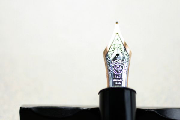
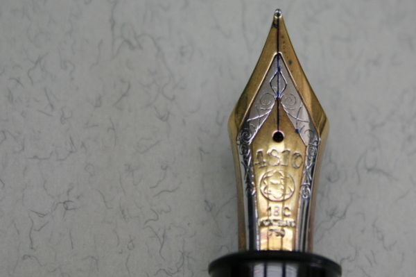
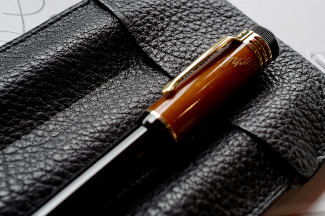
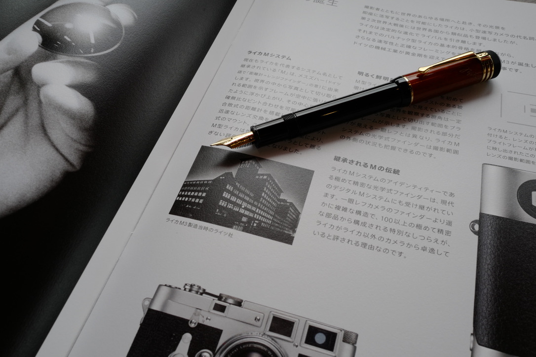
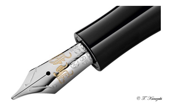
The Writers Edition Schiller is made of material that was a symbol of a changing society, especially in Schiller's time - amber. It is elaborately worked, and this along with the simple elegance of the delicate gold-plated mountings, evokes the style of the heyday of Weimar classicism. Schiller's signature is inscribed on the cap. The finely-engraved 18-carat gold nib is decorated with a small crossbow as a tribute to "William Tell", one of his best-known pieces.
The Limited Edition features a material which in Schiller's day was seen as a symbol of radical social change - amber. Crafted with superb skill, amber, together with the elegance of the fine gold-plated trim, recalls the golden years of the classical Weimar period.
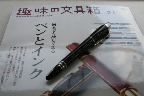
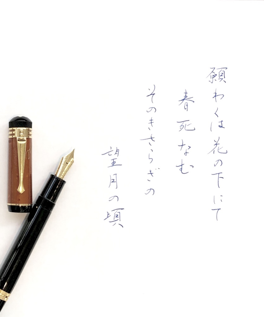
- 西暦 2000年の作家シリーズ -
西行(佐藤義清) 「願わくば花の下にて春死なん その如月の望月の頃」
- Montblanc Schiller -
1992年にヘミングウェイを出してから、モンブランは作家シリーズを毎年1本世に出している。今年は2018年までに作られた作家シリーズは26本になるが、時代が新しくなるにつれて、装飾に凝ったものになり、万年筆のらしさが無くなってきているような気がする。
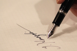
シラーの代表作「ウィリアム テル」への賞賛の印として、小さな石弓が刻み込まれている。

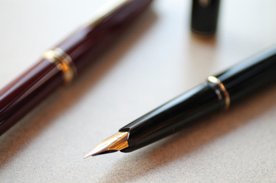
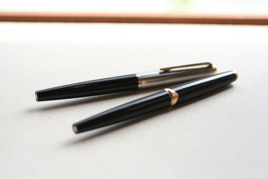
やはり、外見と機能、派手ではない装飾等を考えると、最高であると思うのはヘミングウェイだ。次に翌年出されたアガサ・クリスティ、そしてこのシラーが私の好みだ。他にもデュマやプルーストがあるが、一番だと思っているヘミングウェイに拵えも外見も似ている。シラーは、キャップを尻軸にポストできるので、149と同じように、ペンの角度や筆圧のかけ具合を自分の好みに調整できる。
私はヘミングウェイの実物を見たことがない。現在では、中古でも売り出された当時の3倍の値段で取引されている。理由は分からないが、欲しくて買った万年筆を何故売りに出さなければならないのか不思議でならない。もっとも、モンブランの作家シーズやパトロンシリーズは、数量が限定されているので、何年か経てば必ずプレミアがつくことを狙ってのことなら訳は分かるが、そのような使い方をする人に嫌悪感を覚える。
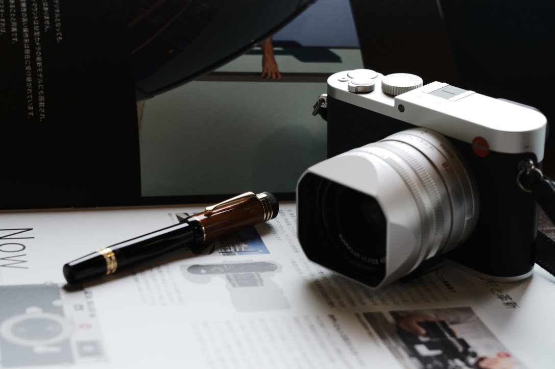
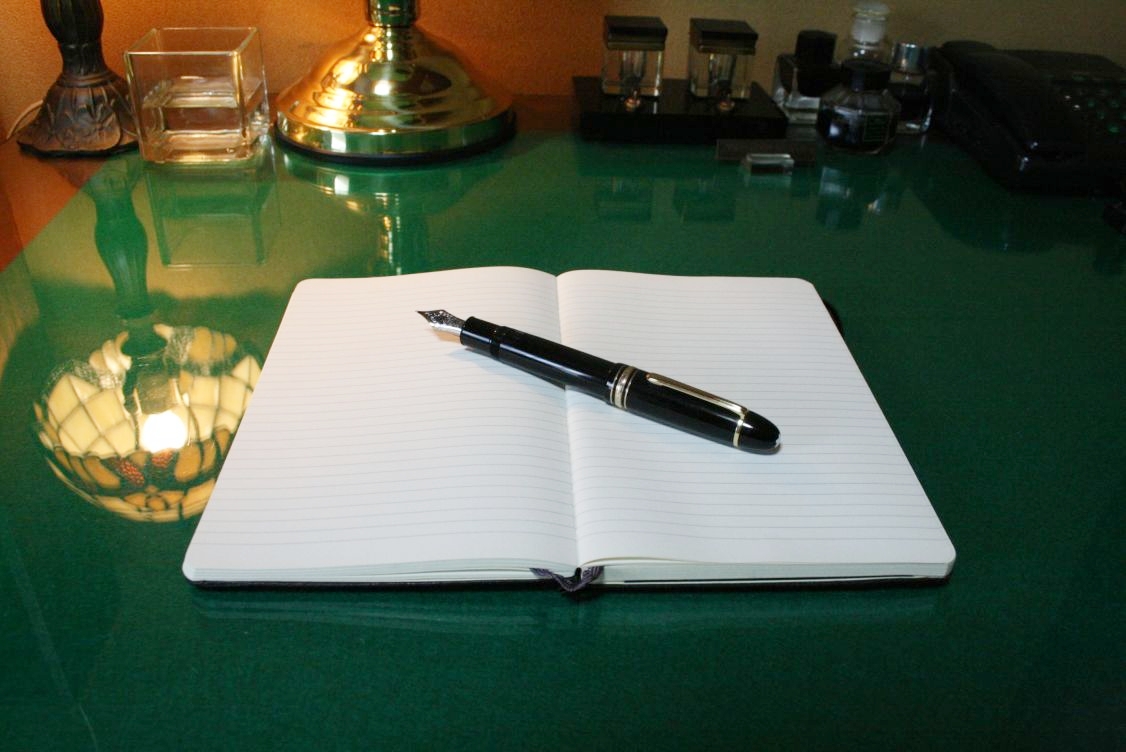
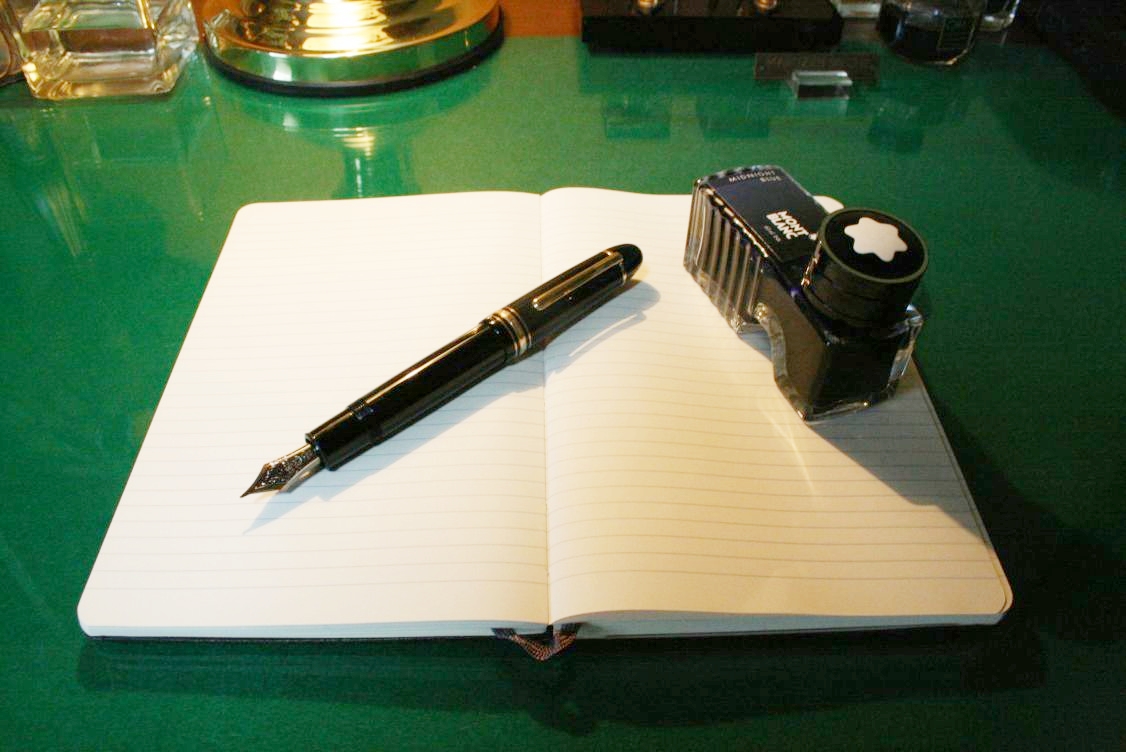
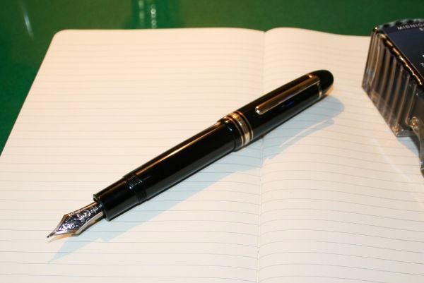
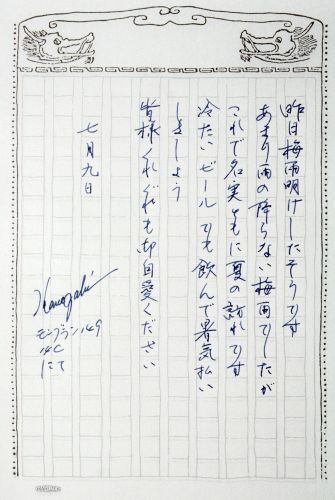
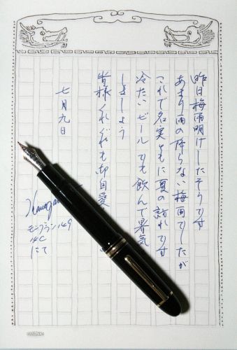
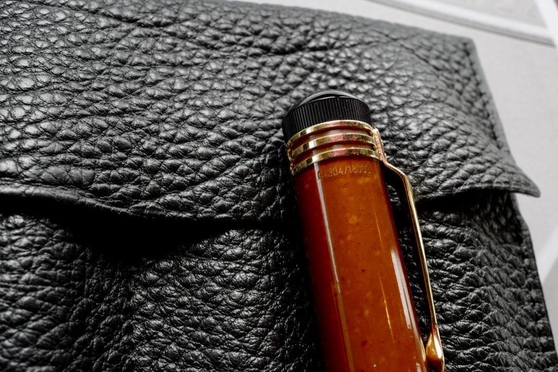
シリアルNo. 4304
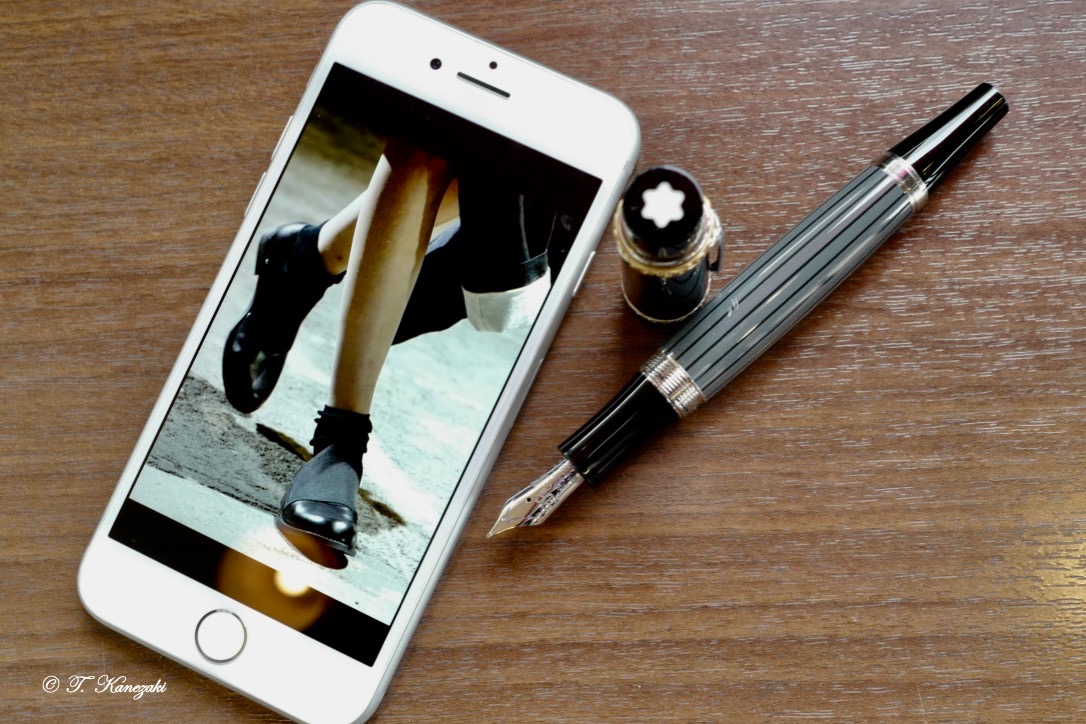
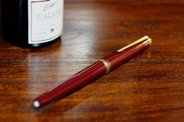
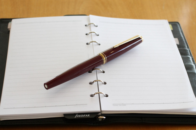
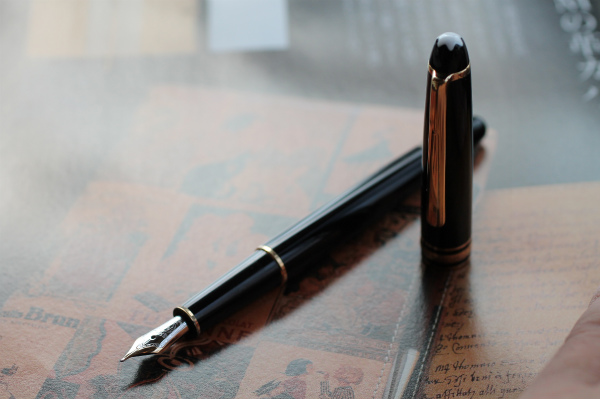
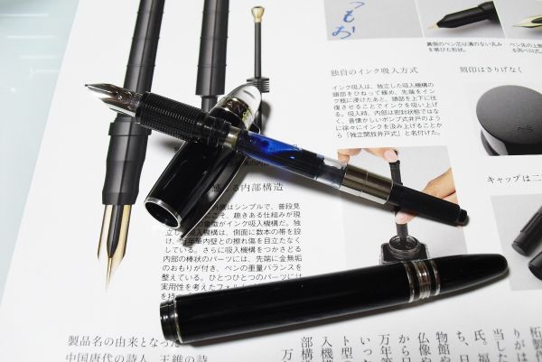
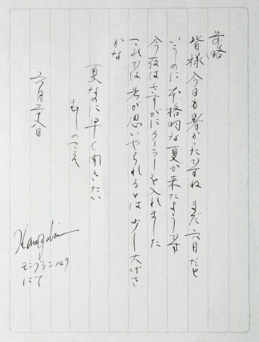
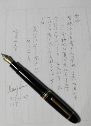
さて、シラーだが、ひょんなことから私の手に入った。発売されたのは西暦2000年、18年以上前の万年筆だ。さすがに、モンブランもこの頃までは、万年筆らしい万年筆を作って世に出している。ペンの重さ、ペン先のしなり、バランス等々申し分がない。手に入れてから、ほとんど毎日のように使っていると、40年前に買った1960年代の149のそれと近い書き味になってきている。数多くの万年筆を所有しているが、毎日使う万年筆は限られている。およそ10本の万年筆を持ち歩いて用途に合わせて使い分けているが、この万年筆は、用途に関係なく何かを書いているだけで楽しい。
- Montblanc Friedrich Schiller -
■ ペン先 : 18金 / 文字幅 : F
■ 機構 : インク吸入式 / キャップタイプ
■ 仕様 : キャップ = アンバー
■ 長さ : 約136mm(収納時) / 約159mm(筆記時) 軸径最大:約12mmφ
■ キャップ径 : 最大:約16mmφ (クリップを除く)
■ 重さ : 約28g
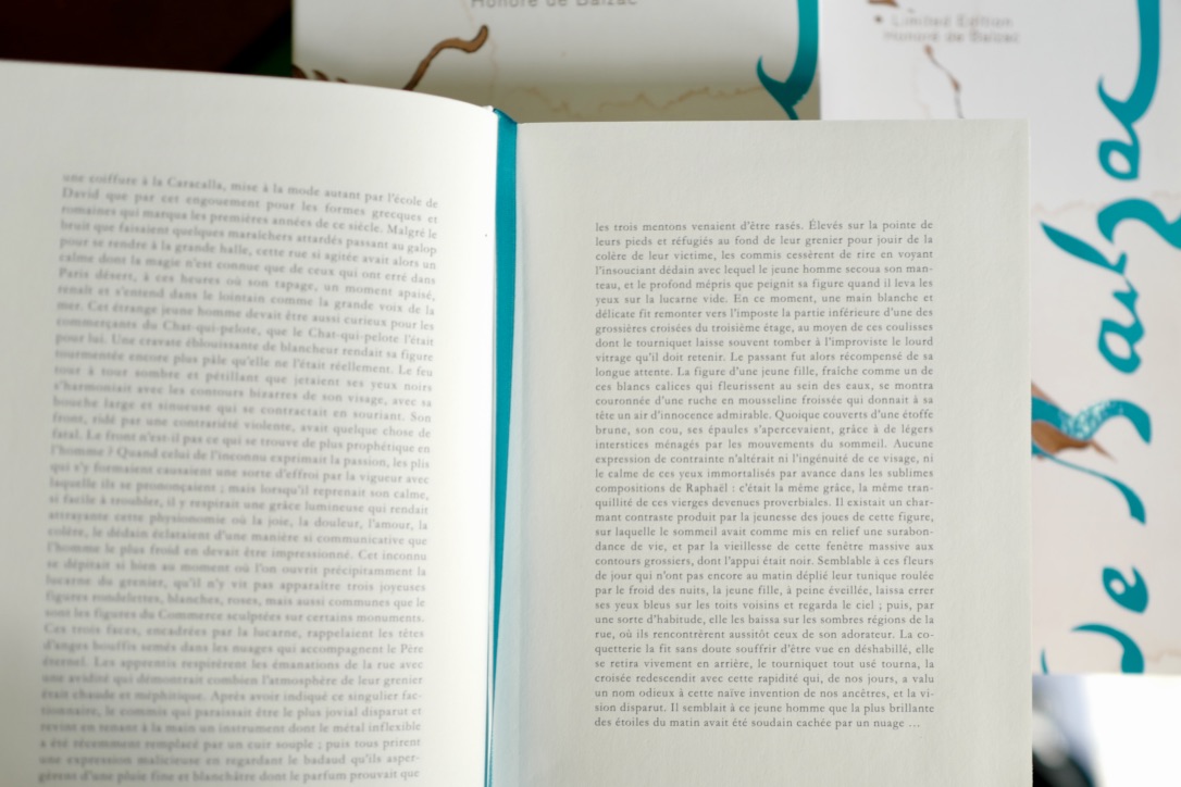
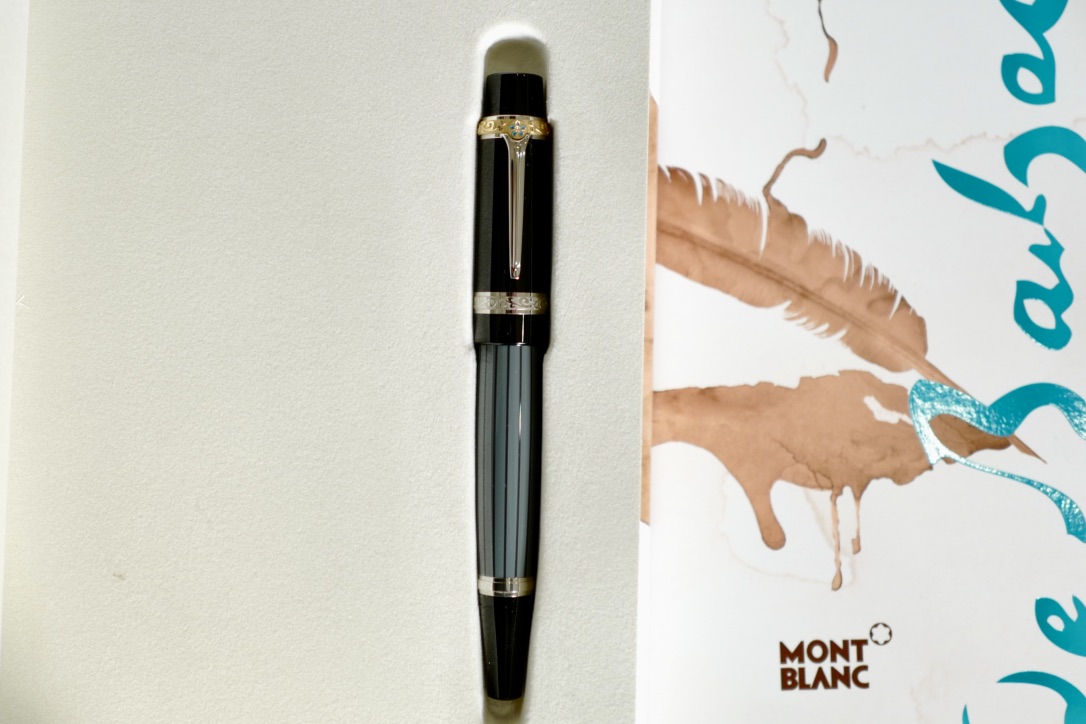
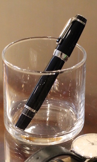
Montblanc Writers Edition 2013 Honoré de Balzac Fountain Pen
- Montblanc says -
With this limited edition Montblanc pays homage to Honoré de Balzac in a writing instrument that is as extraordinary as the writer himself. In its form and design it unmistakeably recalls Balzac's stature and mode of dress, with his pointed shoes being expressed in the shape of the cone. The black high-grade resin cap and the dark grey body decorated with fine stripes pay tribute to the "cutaway" - an
indispensable component of Balzac's wardrobe. He often carried a magnificently decorated walking stick, which is recalled in the platinum-plated clip with turquoise inlay. The engraved initials of Balzac, in typical lead typesetting letters on the partly rhodium-plated 18K/750 solid gold nib of the Writers Edition recall the time he spent as an author, printer and publisher.
One of the main features of this limited edition are the three rings which symbolise the social classes in 19th century France which Balzac so brilliantly described in his masterpiece "La Comédie humaine": the opulent, gold-coated cap head ring stands for the nobility, the platinum-plated, discreetly decorated cap ring for the bourgeoisie, and the simply worked cone ring for the lower social strata.
The great writer's signature decorates the cap as a fine engraving, providing the finishing touch to this extraordinary Writers Edition in honour of Honoré de Balzac.
The Writers Edition Honoré de Balzac is only available worldwide in a strictly limited edition - with the Montblanc guarantee which is provided with all our limited editions. The unique quality of each copy is documented by the edition number engraved on the cap.
- Review -
The pen is solidly built and there is some heft to it. I think the weight of the pen is just right to use the pen's weight to glide over the paper.
As expected from the pen in this price range, I can see and feel the manufacturing precision and details MB put into this pen.
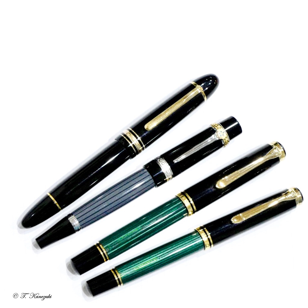
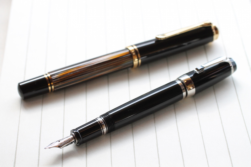
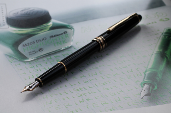
Others commented the stripes on the barrel seems like pulled from Pelikan's. Even though there is no resemblance, I put the Balzac next to my M1000 Green to see if I can convince myself there is any similarity in the stripe designs. (see below)
Initially, before I purchased it, I was not sure if the pen was too garish; but, now that I can have it in my hand, the color scheme is sensible and very suitable for the business setting as well. The ring around the top of the cap breaks from the overall color scheme, which hints elegantly this pen is not the run-of-the-mill fountain pens.
- Honoré de Balzac -
Honoré de Balzac, (20 May 1799 - 18 August 1850) was a French novelist and playwright. The novel sequence La Comédie humaine, which presents a panorama of post-Napoleonic French life, is generally viewed as his magnum opus.
Owing to his keen observation of detail and unfiltered representation of society, Balzac is regarded as one of the founders of realism in European literature.[3] He is renowned for his multi-faceted characters; even his lesser characters are complex, morally ambiguous andfully human. Inanimate objects are imbued with character as well; the city of Paris, a backdrop for much of his writing, takes on many human qualities. His writing influenced many famous writers, including the novelists Émile Zola, Charles Dickens, Gustave Flaubert, Jack Kerouac, and Henry James, filmmakers Akira Kurosawa and Eric Rohmer as well as important philosophers such as Friedrich Engels. Many of Balzac's works have been made into films, and they continue to inspire other writers.
An enthusiastic reader and independent thinker as a child, Balzac had trouble adapting to the teaching style of his grammar school. His willful nature caused trouble throughout his life and frustrated his ambitions to succeed in the world of business. When he finished school, Balzac was apprenticed in a law office, but he turned his back on the study of law after wearying of its inhumanity and banal routine. Before and during his career as a writer, he attempted to be a publisher, printer, businessman, critic, and politician; he failed in all of these efforts. La Comédie Humaine reflects his real-life difficulties, and includes scenes from his own experience.
Balzac suffered from health problems throughout his life, possibly due to his intense writing schedule. His relationship with his family was often strained by financial and personal drama, and he lost more than one friend over critical reviews. In 1850, Balzac married Ewelina Hańska, a Polish aristocrat and his longtime love; he died in Paris five months later.
- モンブラン作家エディション -
モンブランは、1992年に初めて作家シリーズを世に送り出した。初めの頃は、作りも確りしていて、万年筆らしい形で魅力があった。今では、ビンテージものとして状態が良ければ、売り出された時の価格の数倍の値段で取引されている。
順に、1992年ヘミングウェイ・1993年アガサ・クリスティ・1994年オスカー・ワイルド・1996年アレクサンドル・デュマ・1997年ドストエフスキー・1998年エドガー・アラン・ポー・1999年マルセル・プルースト・2000年シラー・2002年フィッツジェラルド、以降略
というふうに、今も毎年作家エディションを作り続けている。しかし、2000年のシラーまでは万年筆の形がモンブランが作ったことが分かる形をしていたが、フィッツジェラルド辺りから、趣向が違って来た。
ヘミングウェイ以来、作家シリーズには興味があったが、それはシラーまでのことで、その後の作家シリーズにはあまり気を惹かれるものがない。他の方なら趣向も違うので興味を持たれたかもしれないが、私にはそれを持って文字を書く気を起こさせない。
ある日、いつもようにモンブランショップに立ち寄ると、馴染みの店員さんが勧めてくれたのが、このバルザックだ。その店員さんは私の趣向をよく知ってくれていてのことだ。少し迷ったが、コーヒーを飲みながら考えて買うことにした。立ち寄って試し書きをした時に、「この万年筆なら使うなぁ」と思っていた。実際、書き心地が良いので、149より使う頻度が高い。この万年筆なら自由にインクを入れられる。モンブランにはモンブランのインクを入れるのが鉄則で、不具合が起きた時に、モンブラン以外のインクを入れていると修理をしてくれないという定説もあるくらいだが、この万年筆なら、それでも良いと思える。
ちなみに、このバルザック以降の作家エディションの箱は、本当の本のようにページがあるわけでなく、形だけが本で、中は普通の箱になってしまった。もっとも、箱が良くて万年筆を買ったわけではないが。
<付記> 上の英文でも述べたが、ペリカンM1000のグリーンストライプは、昔は今のものに比べて、ストライブが極めて細い。写真では見えにくいと思うが、M800のそれと比べると半分程の細さだ。私はM1000の黒とグリーンストライプを一本ずつ持っているが、ストライブの細さでMシリーズの中では、このM1000がもっとも気に入っている。
■ ペン先 : 18金 / 文字幅 : M
■ 機構 : 吸入式
■ 素材 : 樹脂・金属にラッカー仕上げ
■ 長さ : 約140mm(収納時) : 約130mm(筆記時・キャップはポストできない)
■ 軸径 : 軸径最大:約13mmφ
■ キャップ径 :最大:約17mmφ(クリップを除く) / 最大:約18mmφ(クリップを含む)
■ 重さ : 約52g
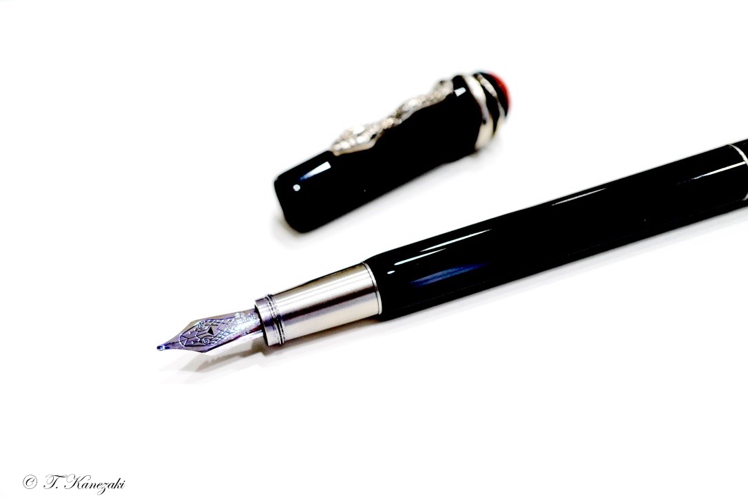
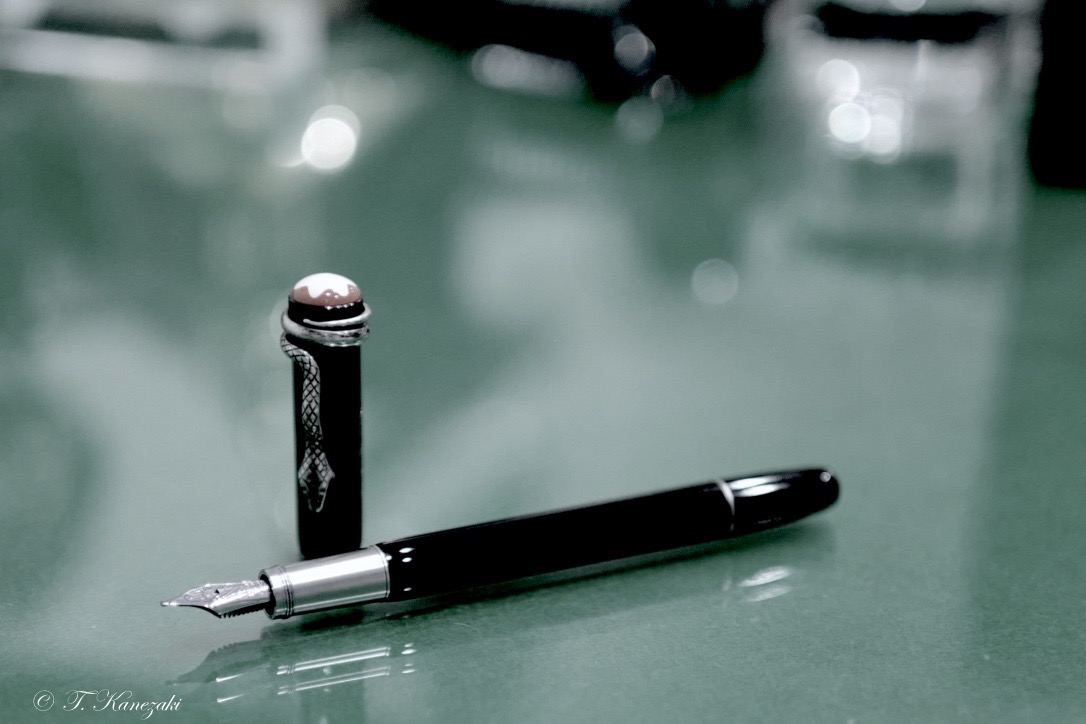
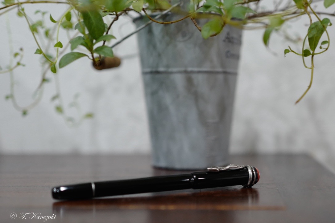
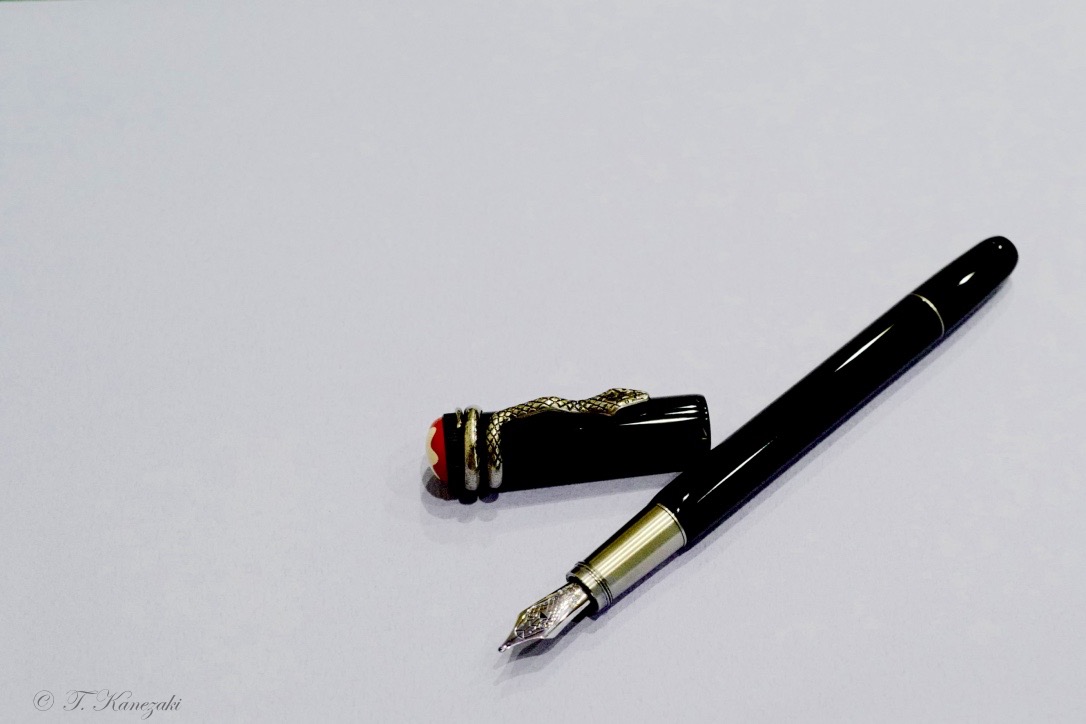
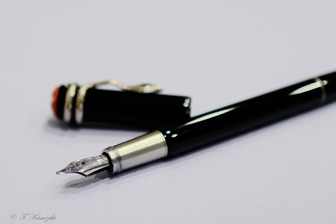
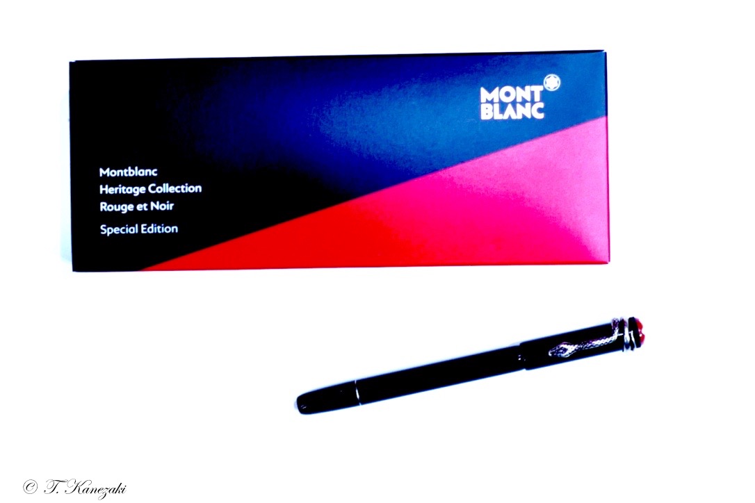
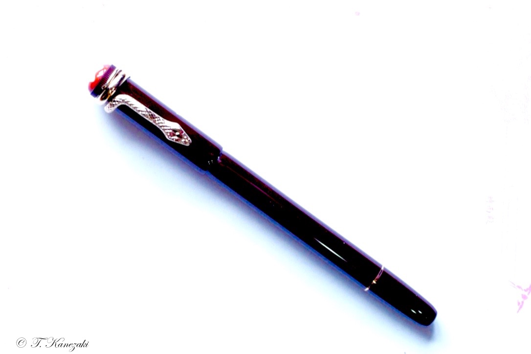
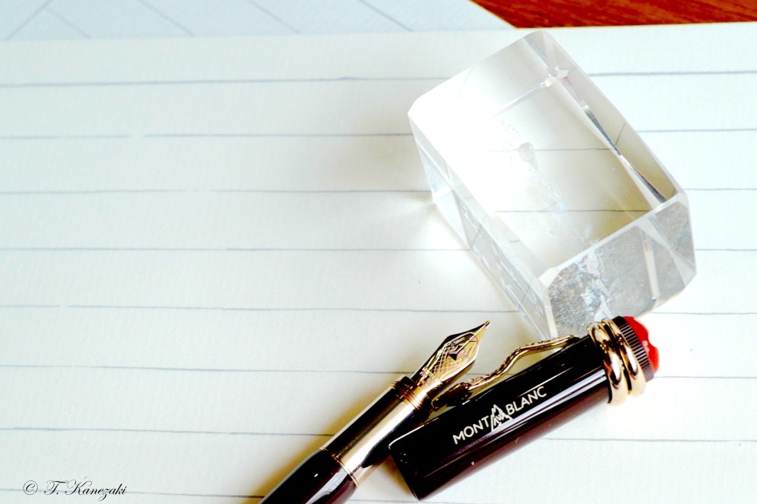
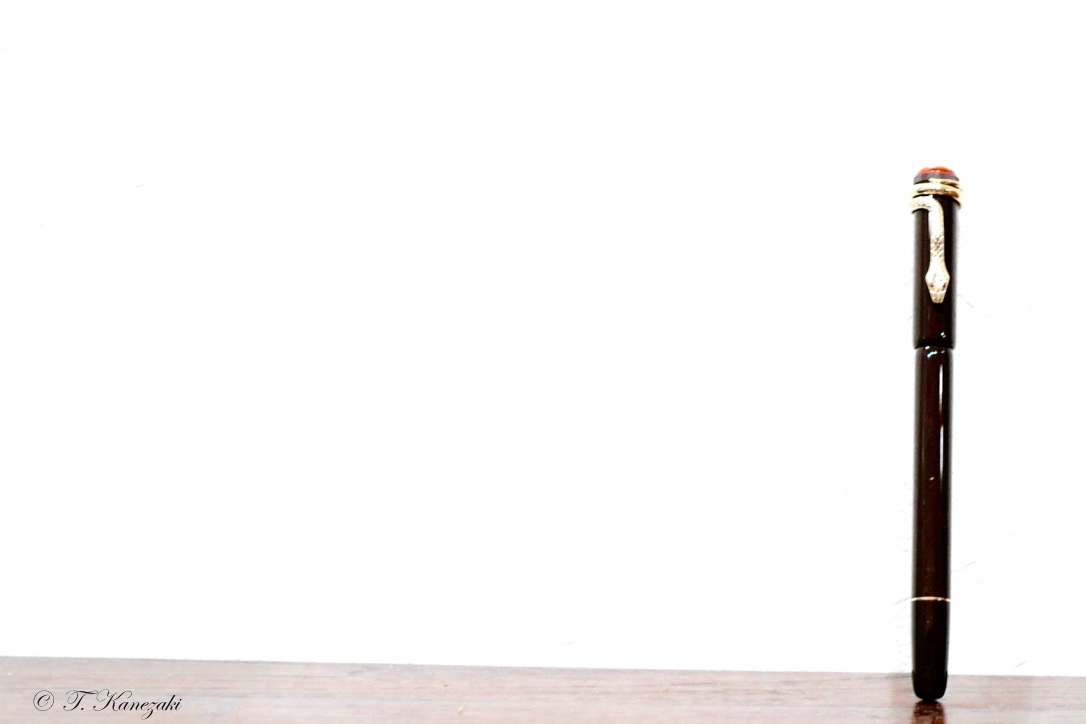
Montblanc Special Edition Heritage Rouge & Noir "Black" Fountain Pen
- Real Heritage collection -
Montblanc says concerning this black edition on the web site as below:
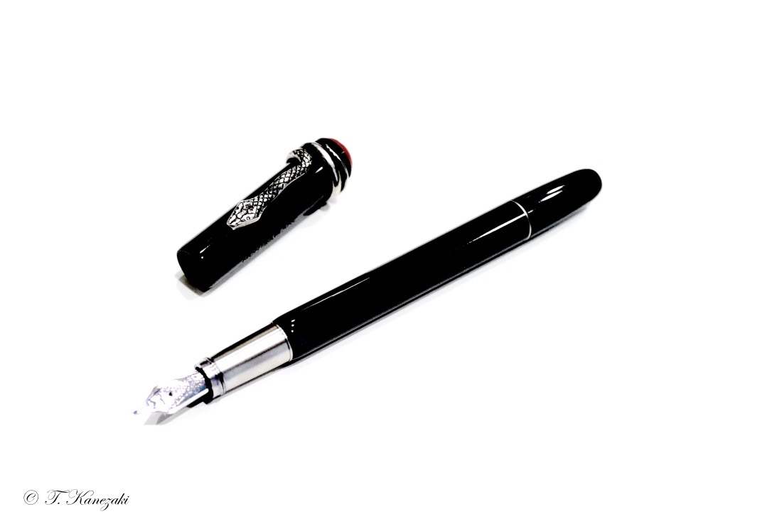
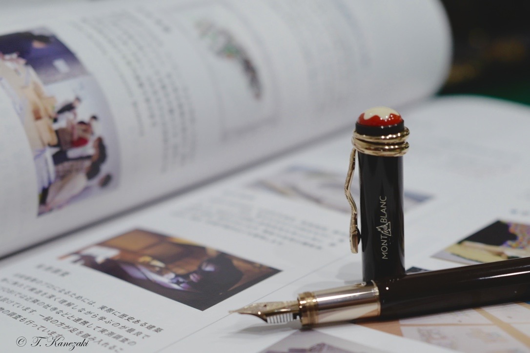
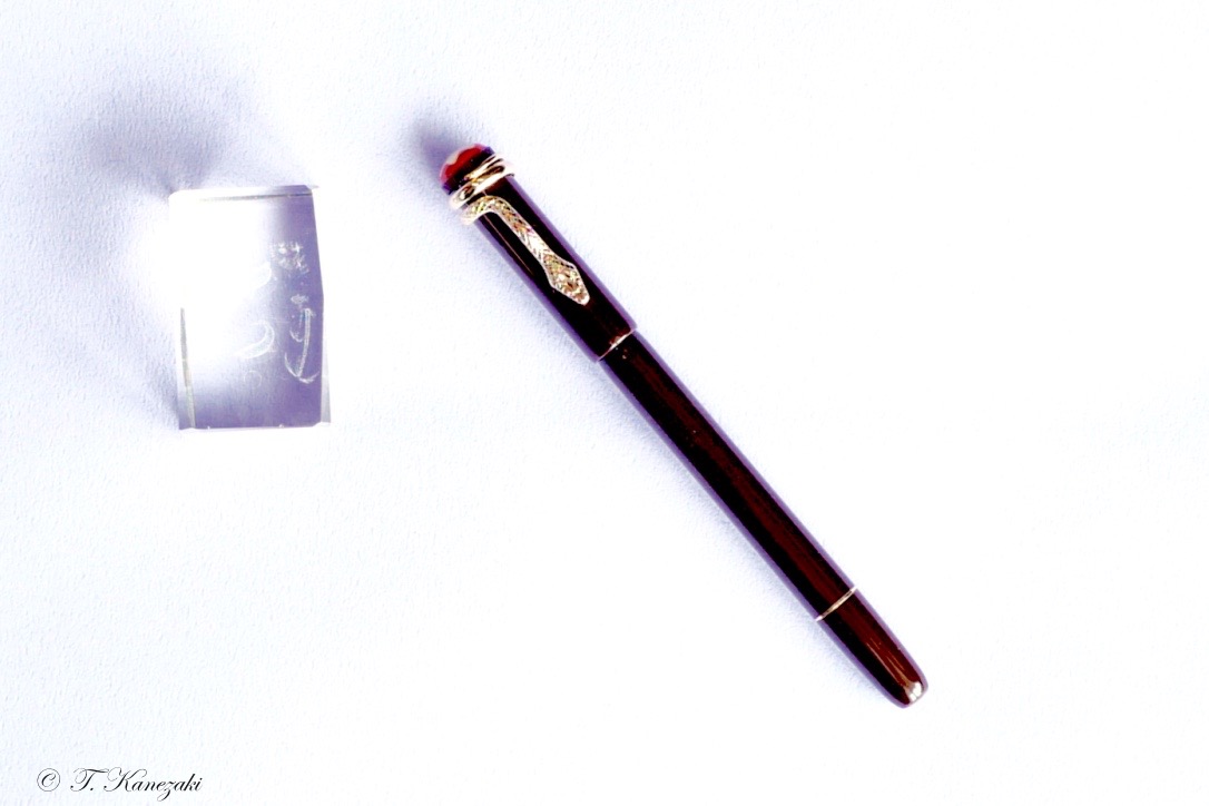
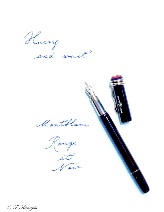
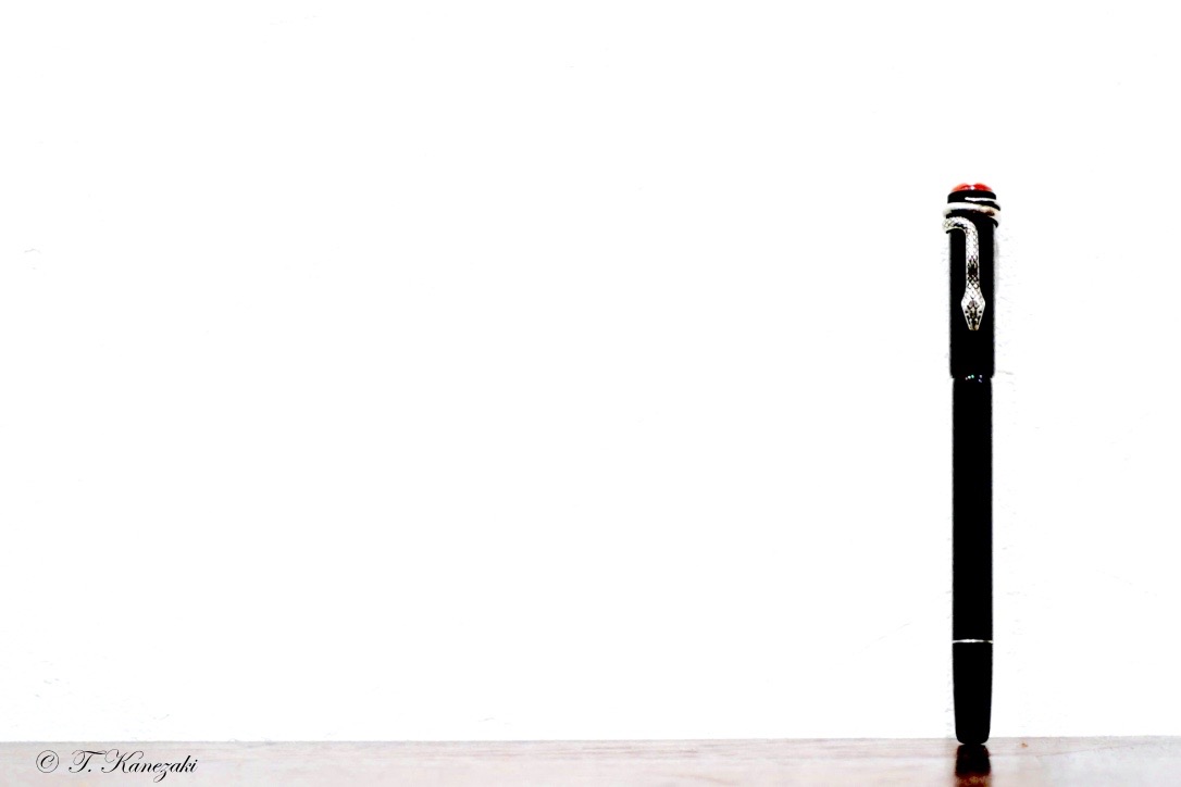
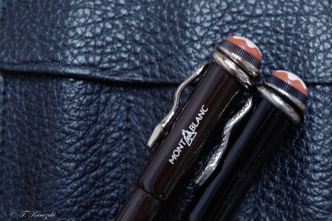
When it was developed in 1906, the 'Rouge et Noir' exclusive fountain pen was considered an outstanding technical achievement, ensuring simple operation without the need for dipping the nib into an inkwell. The Heritage Collection Rouge et Noir celebrates the 110-year-old pioneering spirit of Montblanc. Reinterpreting the legendary writing instrument, it features a longer, slimmer silhouette, modern piston filler technology and craftsmanship refined over generations. The exclusive fountain pen's barrel is made of black precious lacquer combined with black precious resin cap. Snake Clip in vintage look with matching fittings. The clip is made by a stamping and winding process in a special alloy metal, and is aged by a unique galvanic and stripping process.
And I say:
Montblanc's Rouge et Noir pens, part of the Heritage collection, take us back in time to one of their first pens to ever hit the market,110 years ago in 1906! In 1906, pens were still mostly manufactured from ebonite (hard rubber). The current re-issue is divided in three 'tiers', two special editions made from precious resin, and a limited edition in hard rubber.
Both the black and red version of the Rouge et Noir are completely identical when it comes to the general design, but the small details are what sets them apart. The skinny, not-all-too-long design is typical for vintage pens. The color ways are also based on vintage pens, the black resin version has a coral red cap finial with a slightly off-white Montblanc star emblem embedded in it.
Both color ways of coral red and black have a very vintage look and feel to them, both because of the overall design, and the materials used. The coral red resin plays a pretty big role in the appearance of the pen, even on the black version.
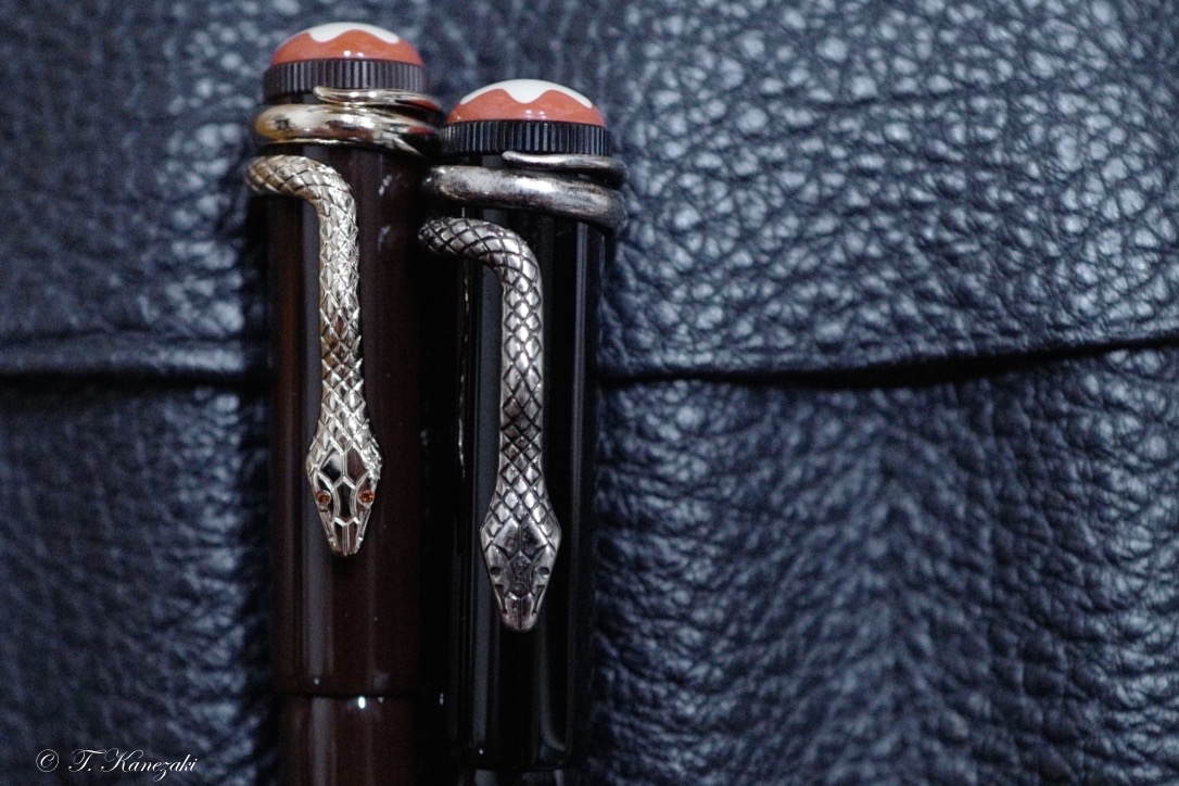
The most prominent design feature is of course the snake clip wrapped around the top of the cap. It's a big part of the marketing around this pen, and with reason because it's the first thing you notice about the Rouge et Noir. It's quite a stand-out feature, but definitely in a good way. The metal clip has a weathered appearance (similar to aged silver, yet it's not a silver clip) which is achieved through specialized galvanizing methods (according to the MB website).
Vintage pens that are usually not as large as modern ones. In that regard, Montblanc did a good job recreating the vintage design.
The skinny profile, especially at the section where it's not much thicker than a wood-cased pencil, might put some people off. Being a special edition pen, I think most people would expect something a bit larger.
To my surprise, these versions are actually piston fillers. Being so slender and relatively small, I can imagine the ink capacity won't be much to write home about, and there's no ink window to keep track of how much ink is left.
The Rouge et Noir is by no means heavy, but it definitely feels solid in the hand, despite the smaller size.
To make up for the size, Montblanc once again delivers with a beautiful nib design. With the grand theme obviously being the snake, the 14k gold nib features a minimalistic depiction of a snake head.
Apart from the nib, another feature that shows upon uncapping the pen, is the metal grip section. It has a brushed finish that actually doesn't feel slippery while writing, and the threads are at the front of the section, instead of at the transition from section to barrel, which makes it a rather comfortable pen to hold, despite the lack of girth.
The design is refreshing, something that stands out from the current selection of modern pens, and with a strong nod to vintage design.
- ブラック・エディション -
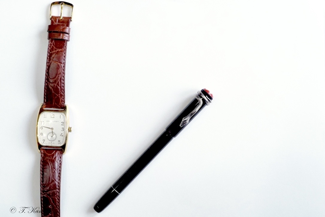
モンブランのルージュ・エ・ノワールは最初にコーラルカラーを出し次いで、ブラック・エディションを出したようだが、私がモンブランショップを覗いた時(2016年)には、すでに両方がショーウィンドウに並んでいた。クリップの蛇の形が目を引く。次に値段を見て驚く。スペシャルエディションとはいえ、この小さな万年筆がそんなにするのかと誰でも驚くと思う。
しかし、ビンテージ好きには、心を動かされる。現代の標準的な万年筆に比べると、昔の万年筆は小さかった。私が持っているものや、知っているビンテージものは、全部、「小ぶり」だ。洋の東西を問わず、昔の万年筆は現代のものと比べると小さいのが標準だった。
このルージュ・エ・ノワールを見た時に、ある種の郷愁を覚えたのは私だけではないと思う。実は、前にこのホームページで紹介したトロピックブラウンより先に、このブラック・エディションを買っていた。コーラル・エディションを買わなかった理由は前の記事でも書いたが、私の手に合わないだろうと思ったことと、ブラック・エディションと比べて、ペン先が硬かったからだ。硬いと言っても、あくまでブラック・エディションと比べての話だが。
店頭で手にとってみると、見かけより重い。見かけでは、BICのボールペンと変わらないのではないかと評する海外ユーザーもいるくらいだ。しかし、持ってみると、そうではないことが分かる。ますます、この万年筆に魅了されていく。そして、見かけからは思いもつかない値段を払って自分のものにする。
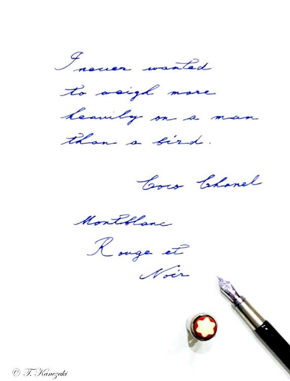
I never wanted to weigh more heavily on a man than a bird. - Coco Chanel -
男の人に小鳥の重さほどの負担もかけたいと思ったことはないわ。(ココ・シャネル)
このルージュ・エ・ノワールはピストンフィラーだ。それも魅力の一つで、手間のかかる方が何故か愛着が湧く。ボディとキャップは素材が違うらしいが、見かけでは分からない。スムーズな手触りが、使っていて心地よい。ペン先の金属部分には、指が滑らないような細工がされている。ボディのラッカーと、この金属部分の細工によって、どの部分を指先に当てても気持ち良く書くことができる。
吸入式だがインク窓がない。持ち運び用には不便だが、定期的にインクの量を見たり、補充したりすることを要求されるのも、スペシャルエディションだからこそ、許されるのかと思わざるを得ないと諦めている。この万年筆にインク窓は似合わない。また、ビンテージ万年筆には、どれもインク窓などなく、万年筆を使うのには、手間がかかるのが当たり前だった。そう思えば、ますますこのビンテージ感に好感が持てる。
ちなみに、2018年8月現在、国内と海外では異なる色柄のルージュ・エ・ノワール・スパイダー・エディションが売り出されている。
■ ペン先 : 14金 / 文字幅 : M
■ 機構 : ピストン吸入式 / キャップ装着時 160mm
■ 仕様 : レジン(樹脂) (キャプはしない仕様)
■ 長さ : 約136.5m(収納時) 約127mm(本体のみ) 軸径最大:約10.5mmφ
■ キャップ径 : 最大:約10.5mmφ (クリップを除く)
■ 重さ : 約35g