

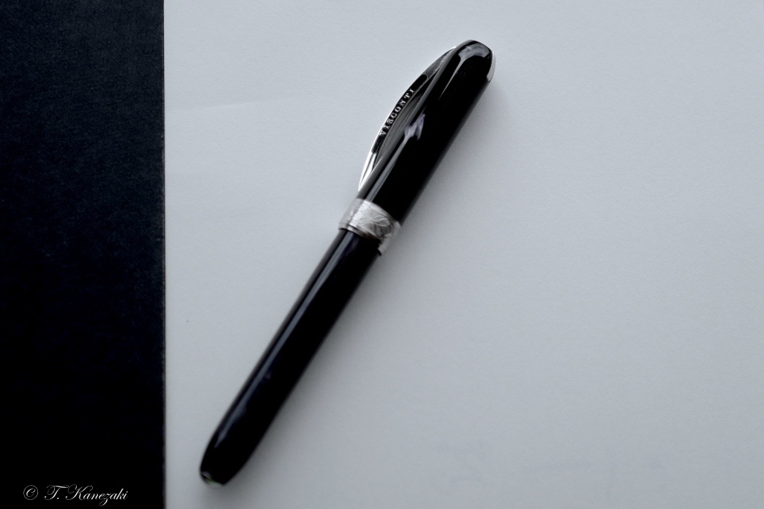

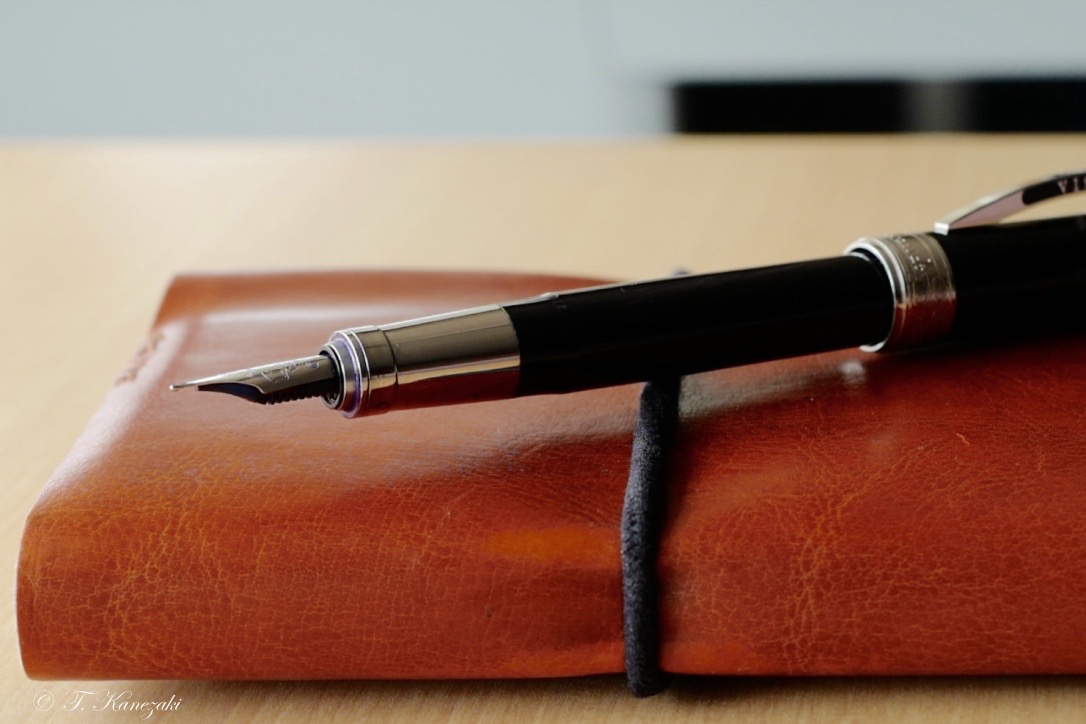

Visconti Rembrandt Fountain Pen - Black
- I prefer "Rembrandt" Christie" Edition -
Recently Visconti changed the logo mark from the black to silver color on the characteristic arched clip. I prefer the old logo mark because it's one of the accent and contrast of the Visconti fountain pen. So I'm lucky I bought the two Visconti fountain pens with black logo on the clip. 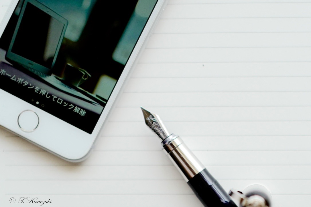
Now I introduce Visconti Rembrandt black edition. It is often compared with Visconti Van Gogh which has dodecahedron or much more recesses and projections ( I don't know exactly). Van Gogh looks a little more gorgeous than Rembrandt because of the color and names such as "Iris", "Vincent Chair" and "Self-Portrait" and so on.
Rembrandt series have neither such fascinate names nor recess and projection cut on the body of fountain pen, just have names of color and column shapes. However, the colors of Visconti Rembrandt originate from his oil paintings. How humble it is! I love the way such humble and modesty names Visconti adopts.
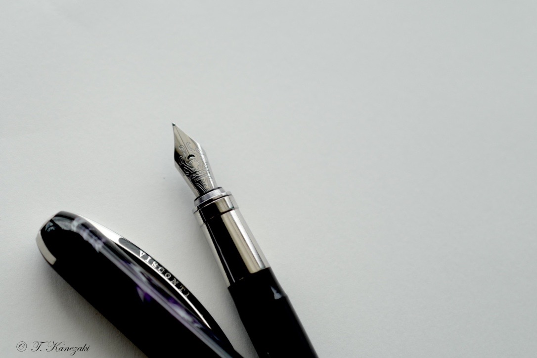
Rembrandt is beautiful pen just as Van Gogh that's a little more expensive. Rembrandt has the same magnetic post cap system as Van Gogh. I'd never experienced such convenient cap system. All you need is to just put the cap into the barrel and the magnet closes the cap automatically. What a convenient cap!
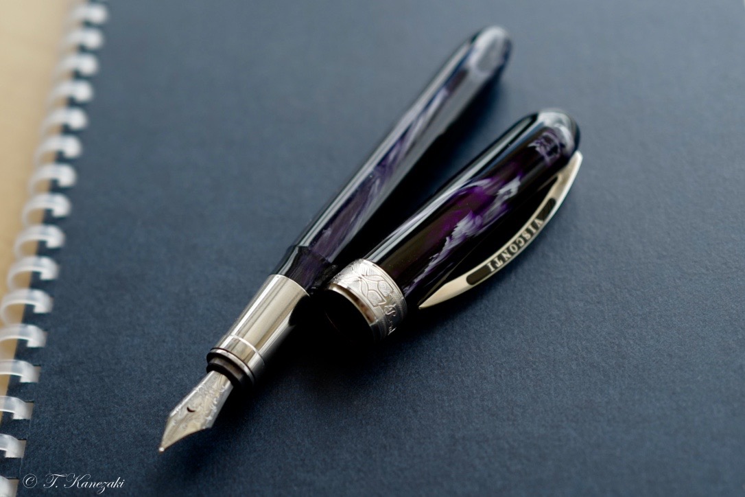
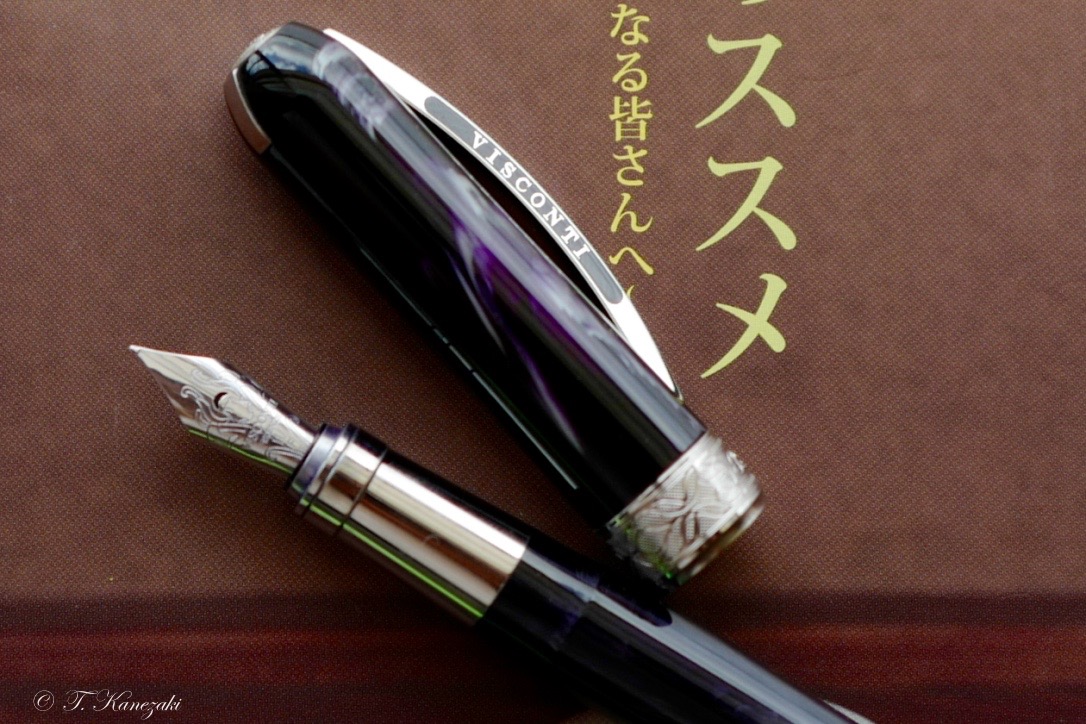
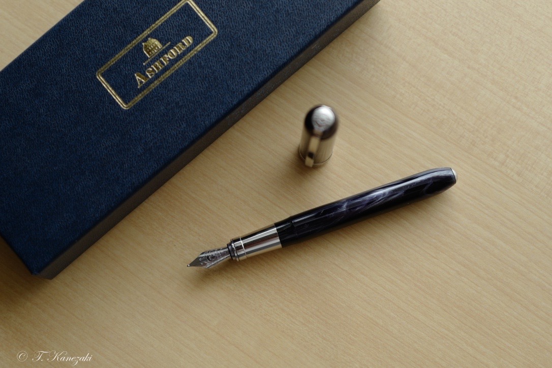
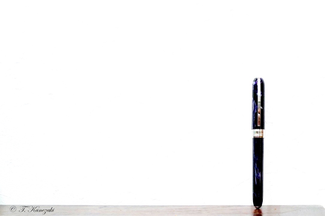
Then about writing touch, it's very smooth and slippery writing more than I expected. My Rembrandt is almost black but has white marble pattern that I love. The Rembrandts are probably made out of translucent plastic sleeve that's painted on the inside. The size is good, not too narrow not too thick.
Only the drawback is that Rembrandts have no ink converter in the box, I mean, you have to buy the converter if you need. I ordered it at the retailor and got it. Anyway Rembrandt is in my daily carrying pen case, I like it so much.
- ヴァン・ゴーよりレンブラント -
ビスコンティのレンブラント。(ヴィスコンティ日本公式では「ビ」ではなく「ヴィ」で表示しているが、「ビ」の方が日本語らしいので「ビ」を使う)最近、ビスコンティはトレードマークのアーチ型のクリップとそこに彫られた黒のロゴをアーチ型は残してロゴは銀色にした。これには賛否両論があると思う。銀色にしたことで、目立たなくなり、すっきりして良いという意見と、長年慣れ浸しんだ少々目立ち過ぎる黒のロゴが良いという意見だ。
もちろん、万年筆会社としては、売れるように作るのだから、マーケッティングの結果の変更だろうと思うが、私は敢えて、目立つ黒色がいかにもビスコンティらしくて好きだ。おとなしいビスコンティなんて要らないと思ってしまう。
もともと、イタリアの万年筆メーカーが出す万年筆の派手な装飾の中で、ビスコンティはリミテッドエディションを除いて、おとなしい色合いだった。もっとも、私に赤や黄色を持てというのは無理な話なのだが。この価格帯だとバン・ゴッホの方が売れ筋だ。ネーミングが「アイリス」や「アルルの寝室」、「自画像」などと上手い。12面体か16面体か、正確には知らないが、ボディのカットも他と違うことをアピールしている。バン・ゴッホを買わなかったのは、随分後で売り出した「星月夜」がなかったからだ。あのおとなしい青色なら買っていたかもしれない。
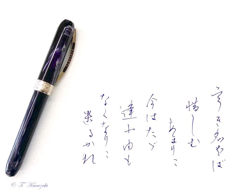
<樋口一葉 「宇(う)き名をば 惜しむあまりに今はただ 逢ふ由もなくなりに遣(け)るか那(な)」>
<インク:ビスコンティ・ブルー>
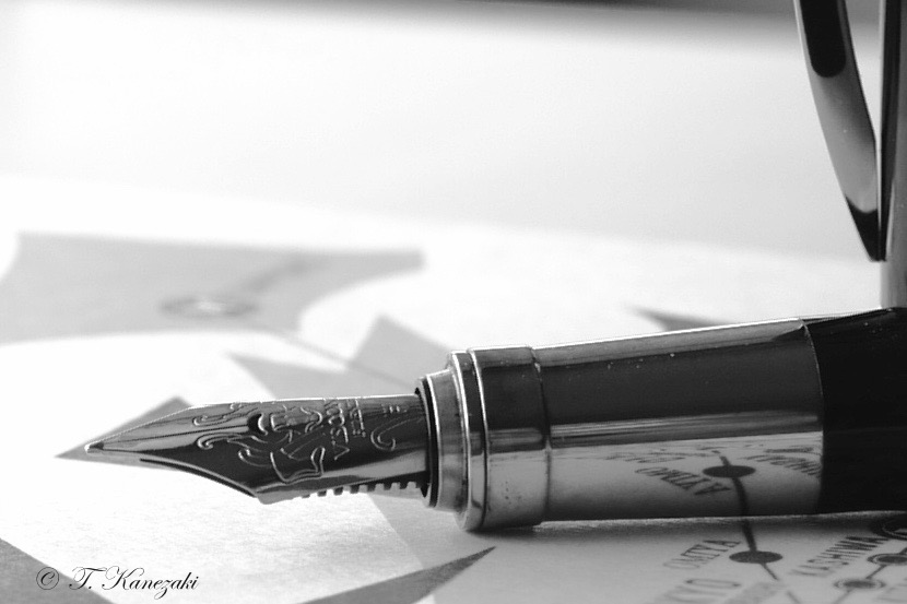
ペン先は同じだから、今はレンブラントで良いと思っている。ペン先はスチールだ。
しかし、書いて驚くのは、スチールとは思えないほどのヌラヌラ感がある。書いていて気持ちが良い。 また、ブラックだが、光の当たり方でマーブル模様が邪魔にならない程度に浮き上がるのも綺麗で、飽きさせない。
ただ一つの難点は、バン・ゴッホには最初からコンバーターがついているが、レンブラントにはついていなくて、別に買わなければならない。それも、いつも店に置いているわけではなく、私の場合は注文して取り寄せてもらった。
日常使うのに、いつも持ち歩いている万年筆の一本だ。