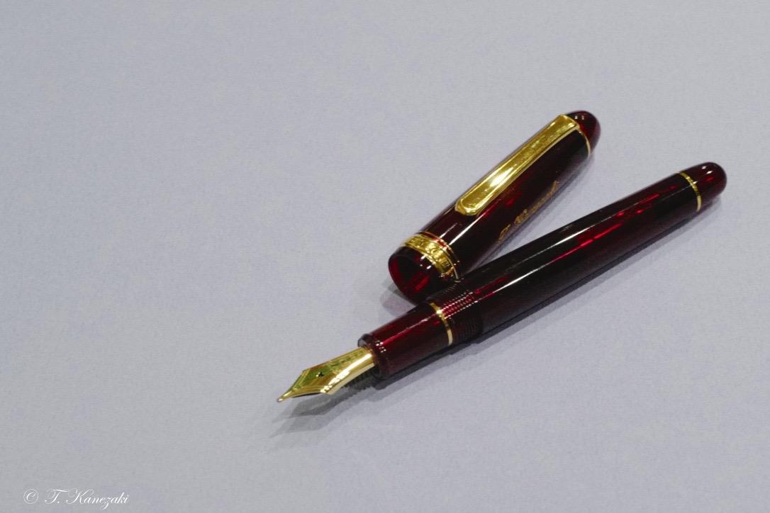
Platinum #3776 Century Bourgogne
- Platinum's Flagship Pen -
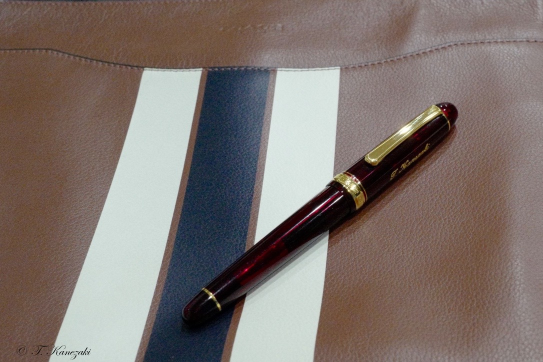
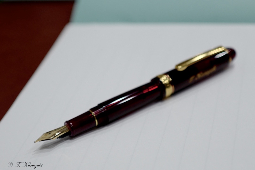
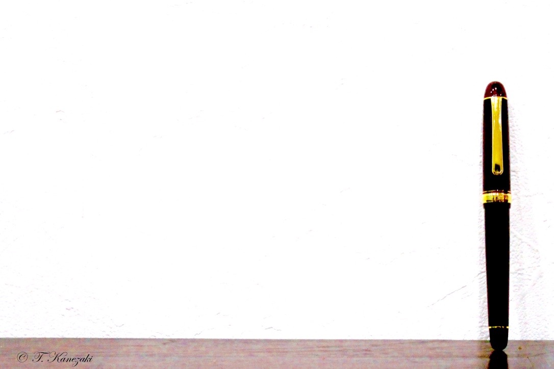
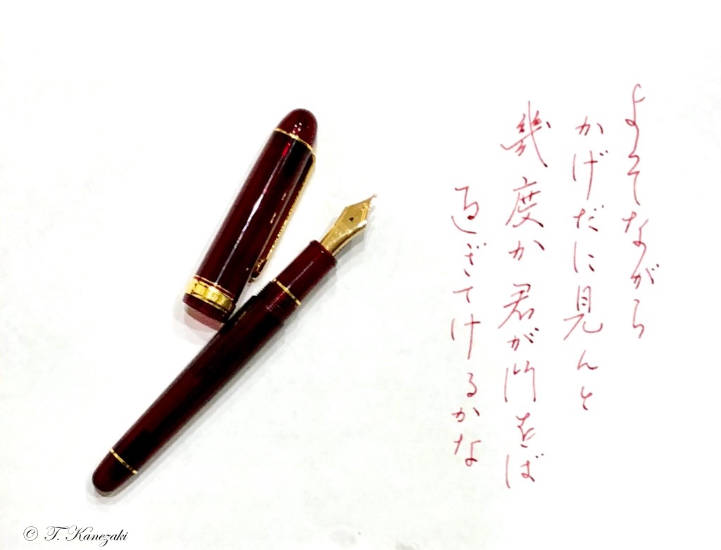
The #3776 Century is Platinum's flagship (the number 3776 is reference to the height of MT. Fuji). I opted for the "Bourgogne" red colored demonstrator. It is translucent but only slightly so, and the color is so deep that the fountain is not cheap-looking at all.Bourgogne is a reference to a wine varietal ( cépage ). The Bourgogne Platinum fountain pen comes in gold trim, which looks very nice. Why am I so particular about the color "Bourgogne" on the very top of the blog article? Yes, I know it. It's because it is rare for me to choose such colored fountain pens like this. Of course, I have the other colored fountain pen, but they are dark color, not such flamboyant at all. They are green, brown, deep blue and so on.
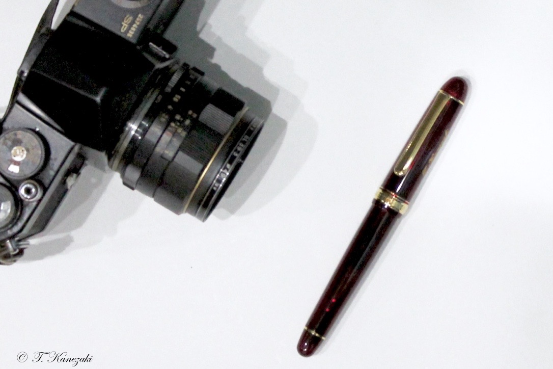
Then why did I opt for the "Bourgogne" red colored Century 3776 instead of "black?" The reason is very simple. It came from a kind of inquisitive or adventurous spirit that I wanted to ascertain the colored fountain pen harmonizes with my hand to hold it. Fortunately, the adventure was successful.
Again, the Century's Bourgogne is not flamboyant but chic. I recommend this "Bourgogne" fountain pen to those who are wondering whether you should purchase the red colored fountain pen.
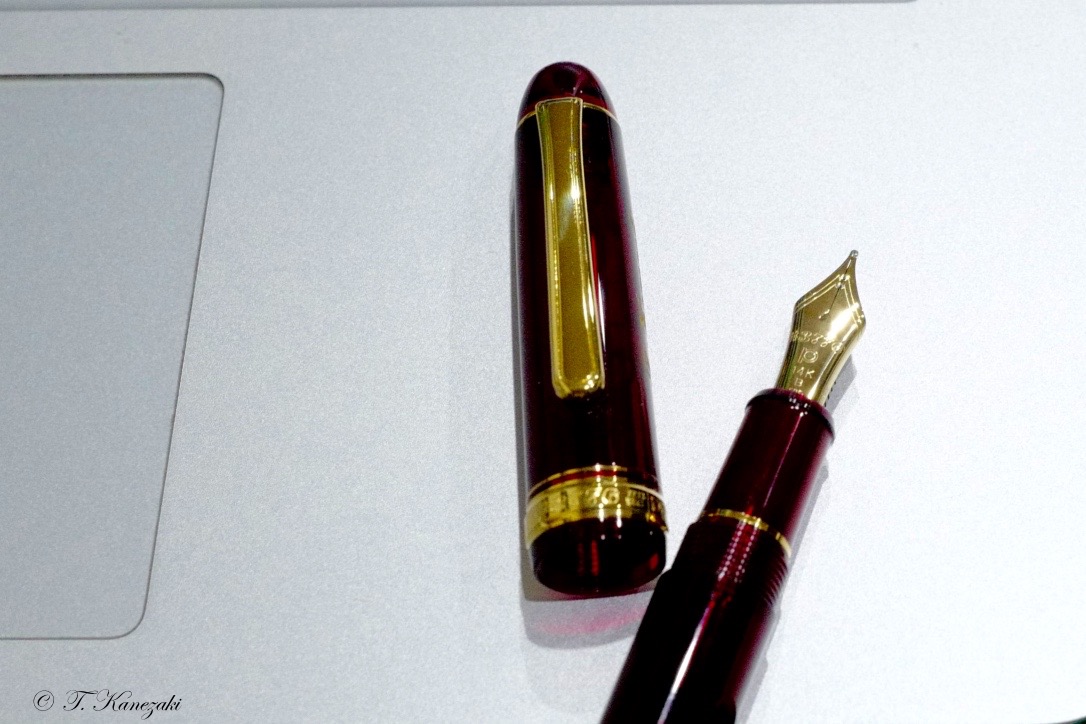
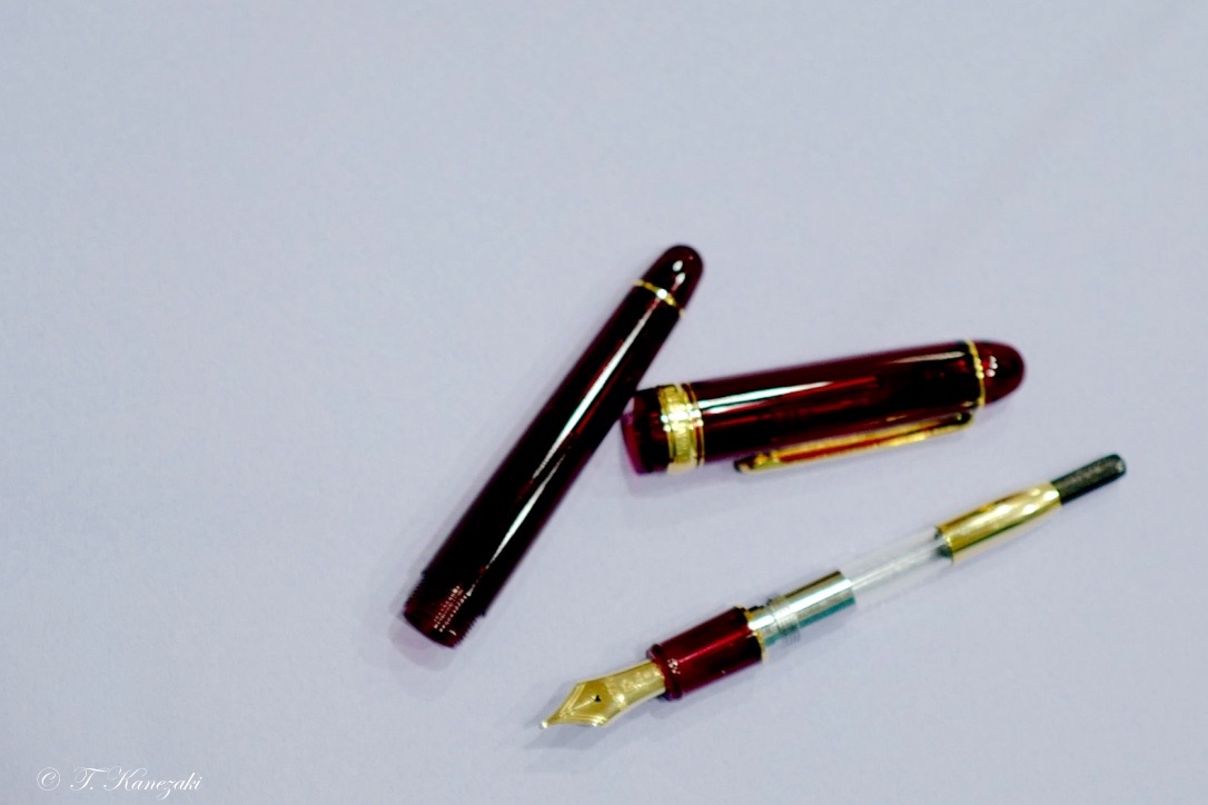
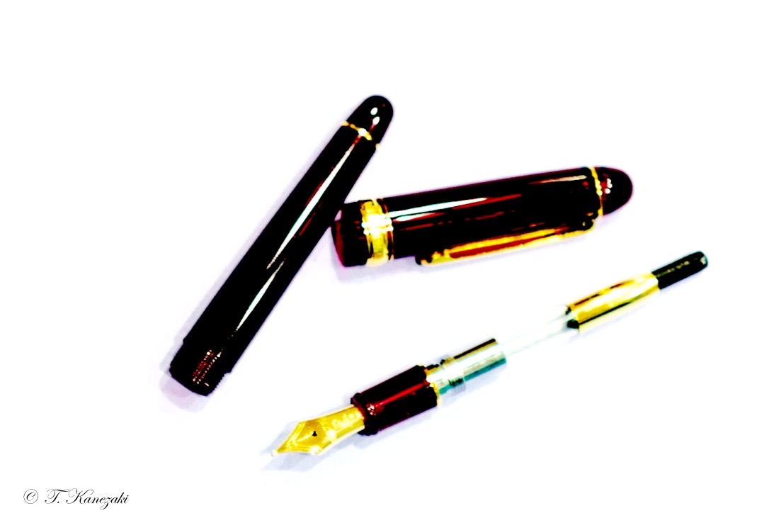
Platinum uses a patented "slip-and-seal" internal cap that keeps the pen from drying out for up to a year of non-use. I don't plan on testing this feature now, but it's nice to know about.
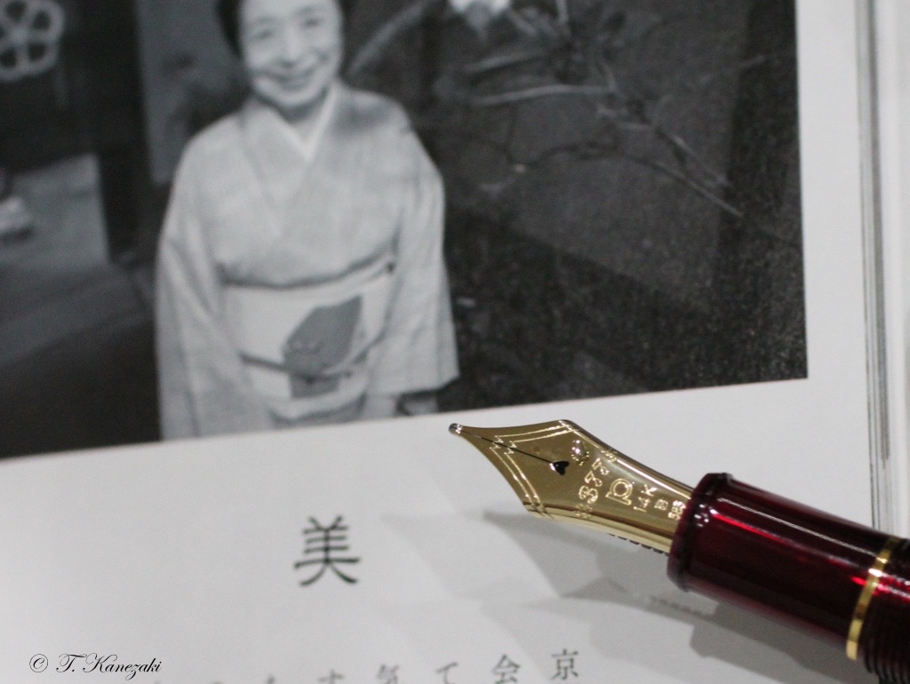
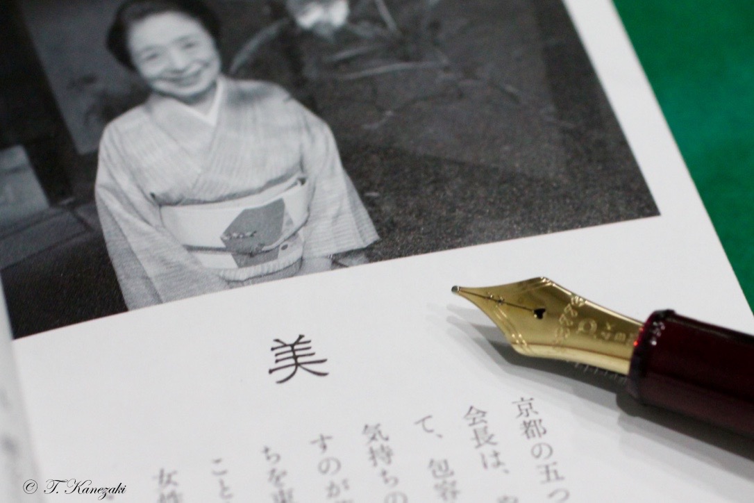
The nib looks like enlargement squid like Montblanc Meisterstück #149. I like that big nibs. I purchased nib width, "Broad." because I didn't want to be attentive with this fountain pen as the other "Fine" nibs require.
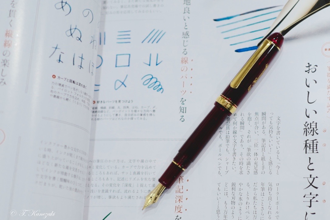
The whole body and nib of the Platinum Century is quite solidly built. Especially, the ink flow is unimpeachable, and the converter is excellent both about solidity and gorgeous appearance. The Platinum 3776 Century tells how excellent Japanese fountain pens are.
On the August 6, 2018, you can see so many variations of the Platinum 3776 Century, such as "Oshino Rhodium finish," "Nice lavende Pinkgold finish," brand new "Kumpoo."
- プラチナ・ブランド -
日本には、3大万年筆メーカーがある。アルファベット順に言うと、パイロット、プラチナ、セーラーだ。世界の万年筆市場で、最も成果を上げているのは、現在、ドイツを抜いて日本である。この3大メーカーの万年筆の良さは世界が認めていると言っても過言ではない。どのメーカーの万年筆も試したが、ハズレと思うものはなかった。今回記事にした「#3776・プラチナ・センチュリー」は、プラチナのフラッグシップだ。事実、このセンチュリーには多くのバリエーションがあり、高価な「高級加賀蒔絵・香苑」や「高級会津蒔絵・銀河」から、比較的求めやすい「ブルゴーニュ」、最近販売されるようになった「忍野」や「薫風」など、メーカーの力の入れようが分かる。
私は、ペン先が「SF」の極端に細いもの(黒軸)と、「B」ニブの太いブルゴーニュを持っている。先に買った「SF]の拵えが良かったので、昨年(2017)初めにブルゴーニュを求めた。
私が、この色を手にするのは極めて珍しいことだ。ある意味で冒険というか、「お試し」というか、自分の手に似合うかどうか試したかった。しかも、これも滅多にしない名入れまでした。結果は、この「お試し」は成功だったと言える。ブルゴーニュはワインの色、しかも深いワイン色なので、赤ではない。金色の名入れもクリップやキャップリングの金色トリムとよく合ったいると自分で思う。
「プラチナ・#3776・センチュリー」の一番の特徴は、何と言っても、この伸し烏賊のように大きいペン先だと思う。モンブランの149を彷彿させる。14金とは言え、これほどの大きさのペン先を付けた万年筆を、この価格で販売するには相当な企業努力があると思う。日本の他社なら2〜3倍の値はつけると思う。我々買い手にとっては嬉しいことだが。
樋口一葉の歌 「よそながら かげだに見んと幾度(いくたび)か 君が門をば過ぎてけるかな」
インク: PLATINUM CLASSIC INK "CASSIS BLACK"
しかし、いくら見かけが良くて値段が安くても、書き味に問題があれば、売れないし、買わないだろう。その点でも、この万年筆には全く問題がない。気に入っているのは、拵えが確りしていることと、インクフローが良いことだが、何よりの特徴はインクを他の色に変えたい時に、普通の万年筆なら2日くらいは水につけておかなければならないが、センチュリーは一晩で良い。
ペン芯がインクに拘らないようにできている。同じ万年筆を様々なインクで書きたい人には、極めて便利な万年筆だ。斯く言う私もそのうちの一人だ。
万年筆は数多く持っている。しかし、いつも身近に置いているのは限られている。このセンチュリーは、その一本だ。