
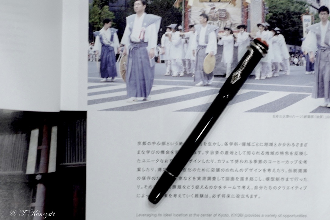
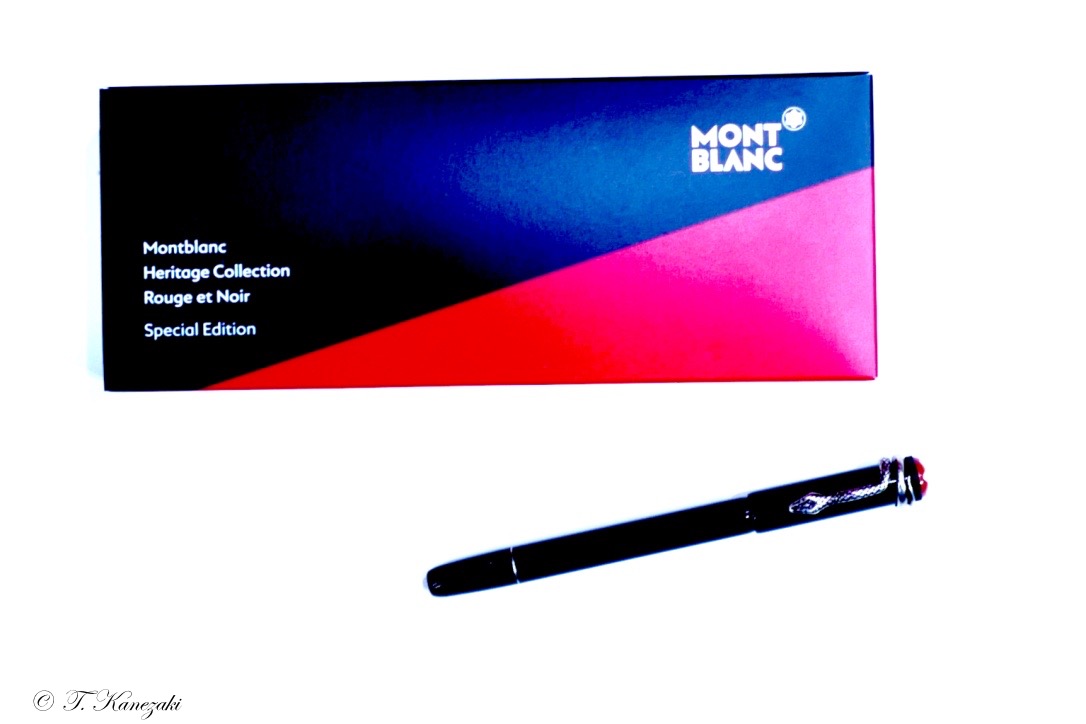
Montblanc Special Edition Heritage Rouge & Noir "Black" Fountain Pen
- Real Heritage collection -
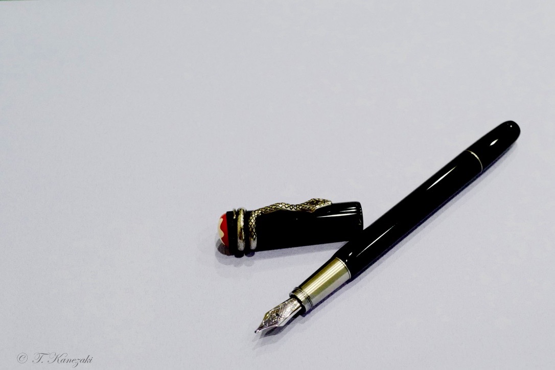
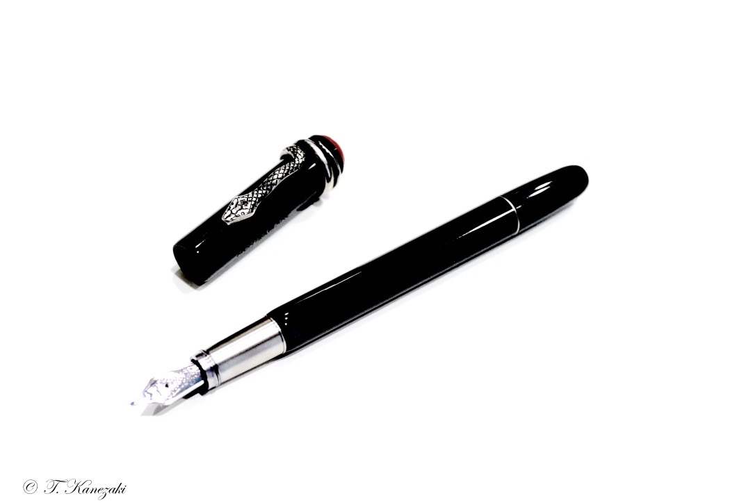
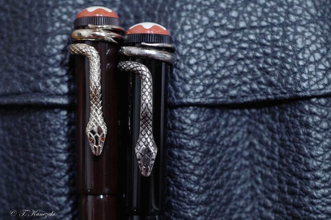
Montblanc says concerning this black edition on the web site as below:When it was developed in 1906, the 'Rouge et Noir' exclusive fountain pen was considered an outstanding technical achievement, ensuring simple operation without the need for dipping the nib into an inkwell. The Heritage Collection Rouge et Noir celebrates the 110-year-old pioneering spirit of Montblanc. Reinterpreting the legendary writing instrument, it features a longer, slimmer silhouette, modern piston filler technology and craftsmanship refined over generations. The exclusive fountain pen's barrel is made of black precious lacquer combined with black precious resin cap. Snake Clip in vintage look with matching fittings. The clip is made by a stamping and winding process in a special alloy metal, and is aged by a unique galvanic and stripping process.
And I say:
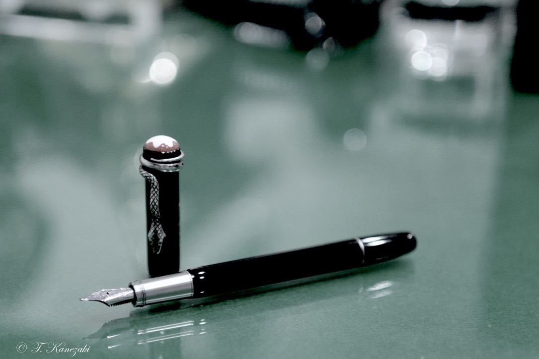
Montblanc's Rouge et Noir pens, part of the Heritage collection, take us back in time to one of their first pens to ever hit the market,110 years ago in 1906! In 1906, pens were still mostly manufactured from ebonite (hard rubber). The current re-issue is divided in three 'tiers', two special editions made from precious resin, and a limited edition in hard rubber.
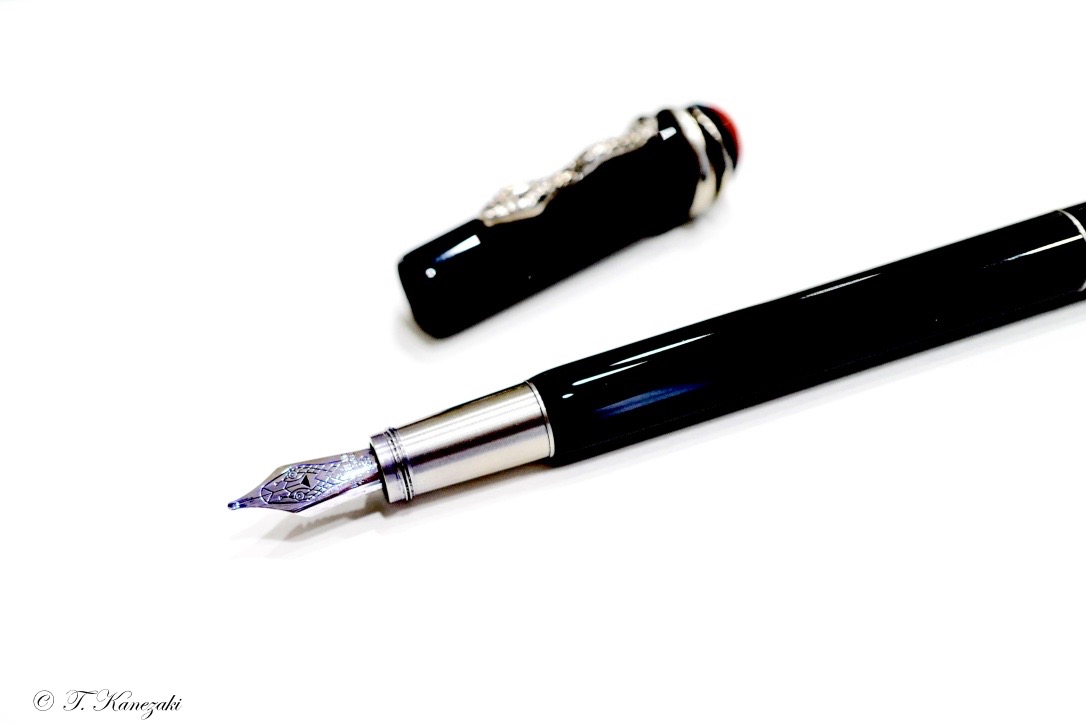
Both the black and red version of the Rouge et Noir are completely identical when it comes to the general design, but the small details are what sets them apart. The skinny, not-all-too-long design is typical for vintage pens. The color ways are also based on vintage pens, the black resin version has a coral red cap finial with a slightly off-white Montblanc star emblem embedded in it.
Both color ways of coral red and black have a very vintage look and feel to them, both because of the overall design, and the materials used. The coral red resin plays a pretty big role in the appearance of the pen, even on the black version.
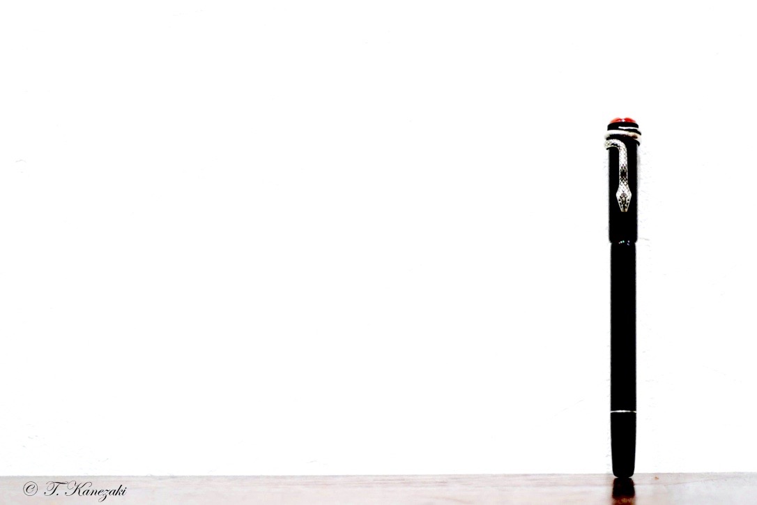
The most prominent design feature is of course the snake clip wrapped around the top of the cap. It's a big part of the marketing around this pen, and with reason because it's the first thing you notice about the Rouge et Noir. It's quite a stand-out feature, but definitely in a good way. The metal clip has a weathered appearance (similar to aged silver, yet it's not a silver clip) which is achieved through specialized galvanizing methods (according to the MB website).
Vintage pens that are usually not as large as modern ones. In that regard, Montblanc did a good job recreating the vintage design.
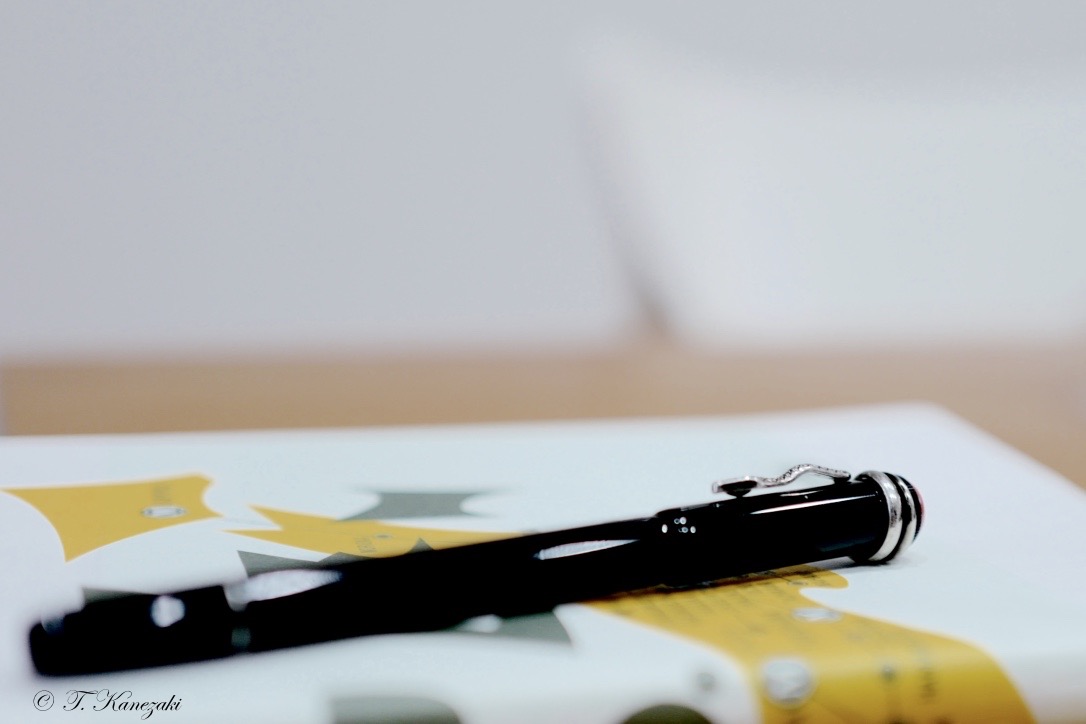
The skinny profile, especially at the section where it's not much thicker than a wood-cased pencil, might put some people off. Being a special edition pen, I think most people would expect something a bit larger.
To my surprise, these versions are actually piston fillers. Being so slender and relatively small, I can imagine the ink capacity won't be much to write home about, and there's no ink window to keep track of how much ink is left.
The Rouge et Noir is by no means heavy, but it definitely feels solid in the hand, despite the smaller size.
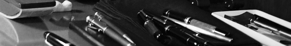
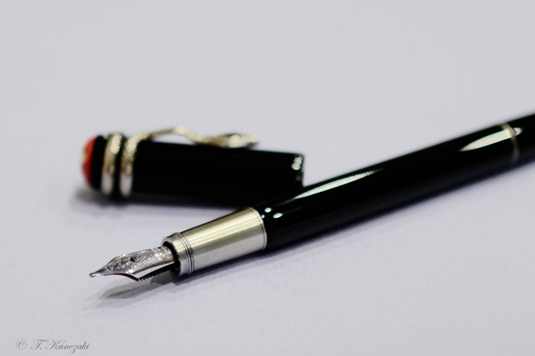
To make up for the size, Montblanc once again delivers with a beautiful nib design. With the grand theme obviously being the snake, the 14k gold nib features a minimalistic depiction of a snake head.
Apart from the nib, another feature that shows upon uncapping the pen, is the metal grip section. It has a brushed finish that actually doesn't feel slippery while writing, and the threads are at the front of the section, instead of at the transition from section to barrel, which makes it a rather comfortable pen to hold, despite the lack of girth.
The design is refreshing, something that stands out from the current selection of modern pens, and with a strong nod to vintage design.
- ブラック・エディション -
モンブランのルージュ・エ・ノワールは最初にコーラルカラーを出し次いで、ブラック・エディションを出したようだが、私がモンブランショップを覗いた時(2016年)には、すでに両方がショーウィンドウに並んでいた。クリップの蛇の形が目を引く。次に値段を見て驚く。スペシャルエディションとはいえ、この小さな万年筆がそんなにするのかと誰でも驚くと思う。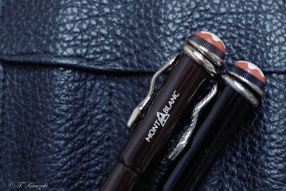
しかし、ビンテージ好きには、心を動かされる。現代の標準的な万年筆に比べると、昔の万年筆は小さかった。私が持っているものや、知っているビンテージものは、全部、「小ぶり」だ。洋の東西を問わず、昔の万年筆は現代のものと比べると小さいのが標準だった。
このルージュ・エ・ノワールを見た時に、ある種の郷愁を覚えたのは私だけではないと思う。実は、前にこのホームページで紹介したトロピックブラウンより先に、このブラック・エディションを買っていた。コーラル・エディションを買わなかった理由は前の記事でも書いたが、私の手に合わないだろうと思ったことと、ブラック・エディションと比べて、ペン先が硬かったからだ。硬いと言っても、あくまでブラック・エディションと比べての話だが。
店頭で手にとってみると、見かけより重い。見かけでは、BICのボールペンと変わらないのではないかと評する海外ユーザーもいるくらいだ。しかし、持ってみると、そうではないことが分かる。ますます、この万年筆に魅了されていく。そして、見かけからは思いもつかない値段を払って自分のものにする。
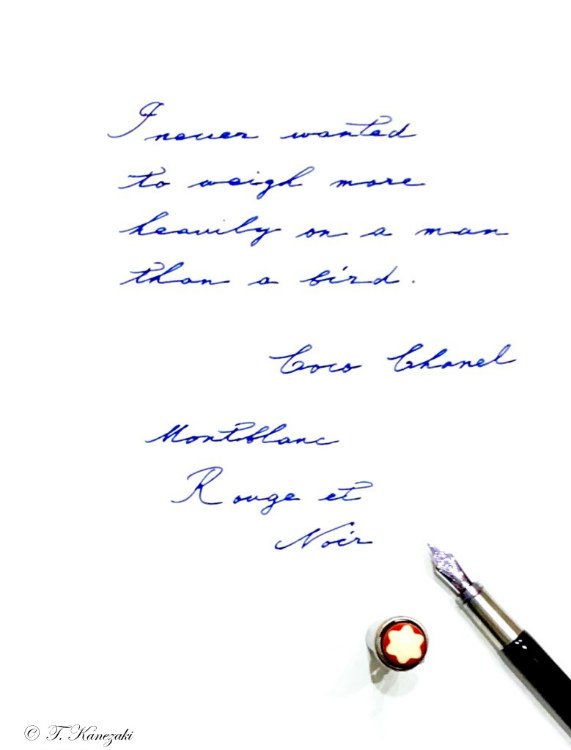
I never wanted to weigh more heavily on a man than a bird. - Coco Chanel -
男の人に小鳥の重さほどの負担もかけたいと思ったことはないわ。(ココ・シャネル)
このルージュ・エ・ノワールはピストンフィラーだ。それも魅力の一つで、手間のかかる方が何故か愛着が湧く。ボディとキャップは素材が違うらしいが、見かけでは分からない。スムーズな手触りが、使っていて心地よい。ペン先の金属部分には、指が滑らないような細工がされている。ボディのラッカーと、この金属部分の細工によって、どの部分を指先に当てても気持ち良く書くことができる。
吸入式だがインク窓がない。持ち運び用には不便だが、定期的にインクの量を見たり、補充したりすることを要求されるのも、スペシャルエディションだからこそ、許されるのかと思わざるを得ないと諦めている。この万年筆にインク窓は似合わない。また、ビンテージ万年筆には、どれもインク窓などなく、万年筆を使うのには、手間がかかるのが当たり前だった。そう思えば、ますますこのビンテージ感に好感が持てる。
ちなみに、2018年8月現在、国内と海外では異なる色柄のルージュ・エ・ノワール・スパイダー・エディションが売り出されている。