Wahl Eversharp Deco Band Rosewood Ebonite Fountain Pen
- Review of PEN HABIT -
Wahl-Eversharp was a much-liked American fountain pen brand that was created in 1916 from a merger of the Wahl Adding Machine company, and later, the Boston Fountain Pen Company. Wahl-Eversharp was one of the larger manufacturers of writing instruments in the US up through the 1940s but faltered with the advent of the ballpoint pen. The Parker Pen Company acquired the brand in the late 1950s and ceased production under that name.
In 2013, Syd Saperstein and Emmanuel Caltagirone re-released the brand under the Wahl-Eversharp name. Syd, a long time W-E collector (often known as "The Wahlnut") had a deep understanding of what made W-E pens special, and so went about trying to recreate more than just the name, but rather, many of the design and aesthetic aspects of the pen. The new Wahl-Eversharp skyline is a near-exact duplicate of the original. And, at the DC Show in August, the new Wahl-Eversharp announced their newly released Decoband.
The 2015 Decoband, released by Wahl-Eversharp this December, is a massive pen. It belongs to W-E's "Gold Seal Oversize" collection. Despite its size, however, it is proportionally identical to the original Decoband (meaning that, although the new pen is bigger, all the proportions of the new pen are equally scaled up from the proportions of the old pen.) The Decoband comes in three colors: Rosewood Ebonite, Black Ebonite, and Lapis Blue Marble Acrylic Resin. There is also a demonstrator version out there that was made for, well, demonstration purposes. It, however, is not publically available at this time. There were limited numbers of these created in the first run (I believe I remember the number 75 per color).
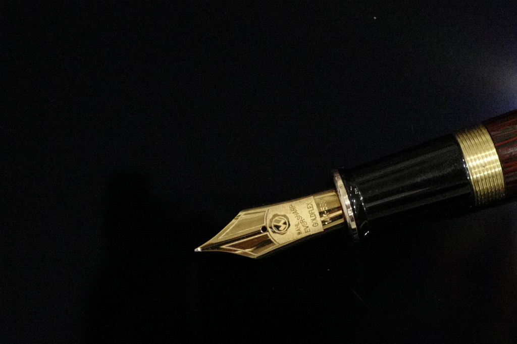
One of the other things that makes this reissue of the Decoband special is the nib that Syd and company decided to include on this new pen. W-E worked closely with their nib manufacturer to come up with a huge #8-sized nib that they are calling the "Superflex" nib. It's 14k gold, for which a new alloy was developed to help replicate flex nibs on vintage pens. The face of the nib is also laser-etched to thin out the material and provide some extra line variation.
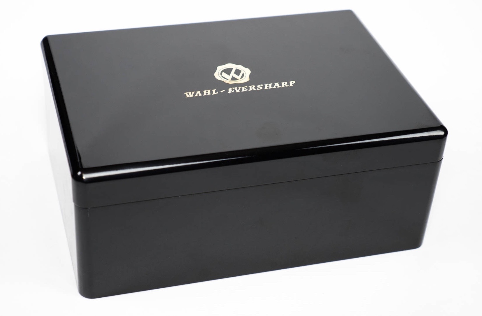
At the DC Show, I pre-ordered the Rosewood Decoband. It arrives in a massive piano-black lacquered case with the Wahl-Eversharp logo inlaid on the lid. Opening the case shows the pen, a brochure, and box of Wahl-Eversharp ink. The case it beautifully made...the kind of case you might want to leave sitting out on the desk. While I probably won't use the case to store my pen, I may see if the interior lining is removable, because it is large enough to serve as a great place to store inks, sample vials, repair materials, or other pen-aphernalia.
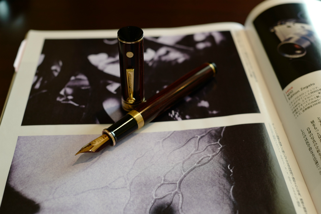
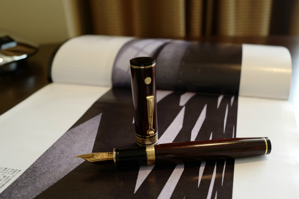
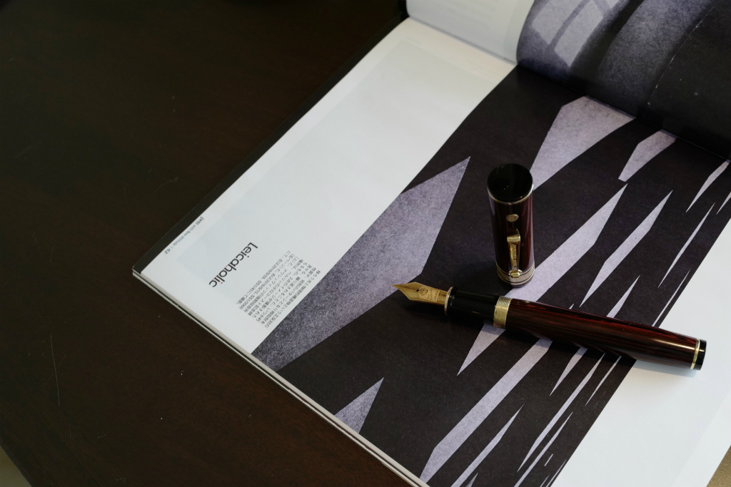
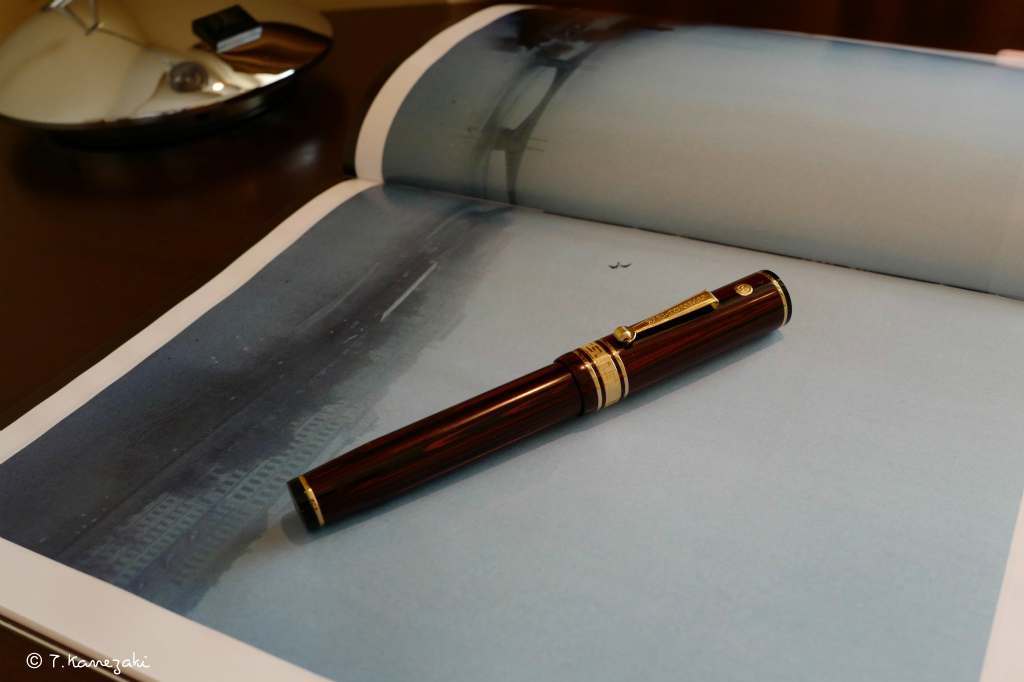
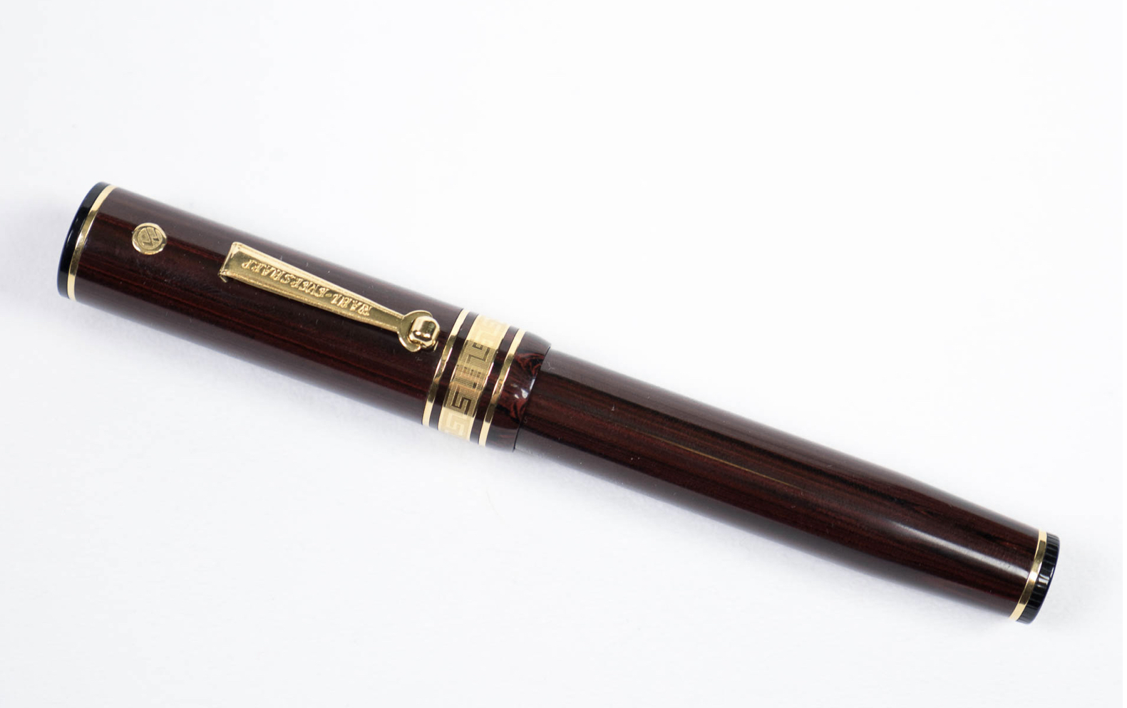
The pen itself is stunning. The rosewood ebonite from which it is made is finely figured with delicate threads of red and black ripples that, from a distance, really do give the appearance of wood grain. The ebonite is polished to an absolute mirror finish. It's one of the nicest polishes I've ever seen on an ebonite pen.
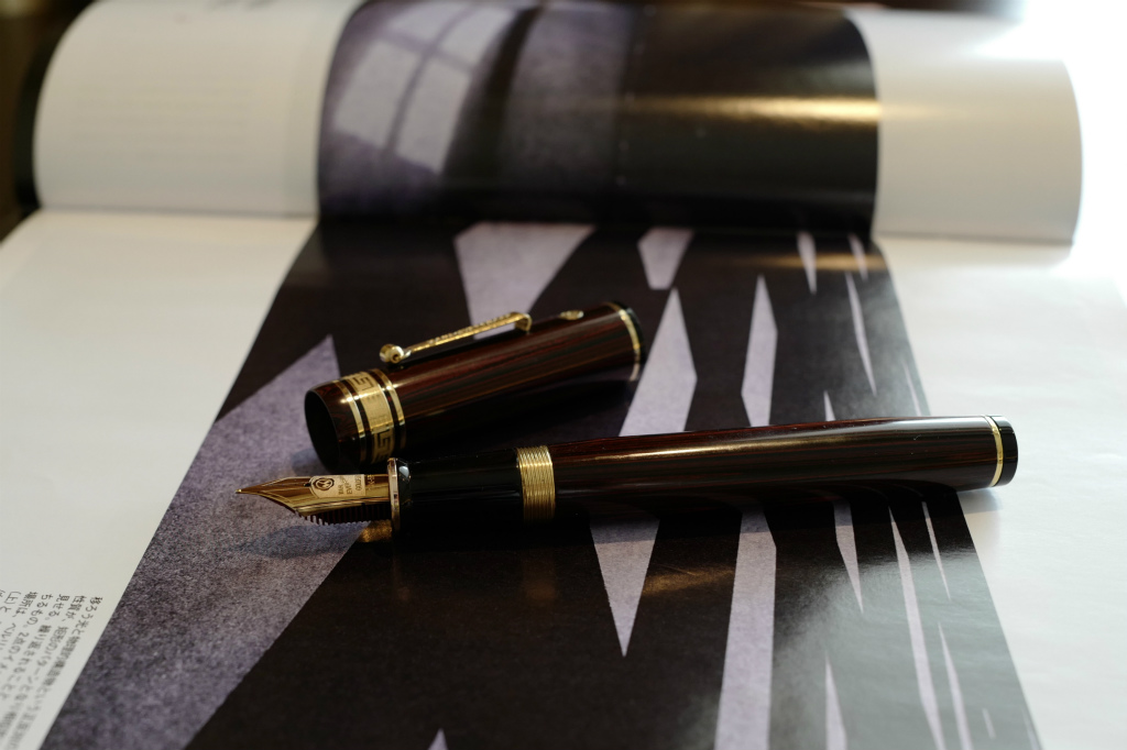
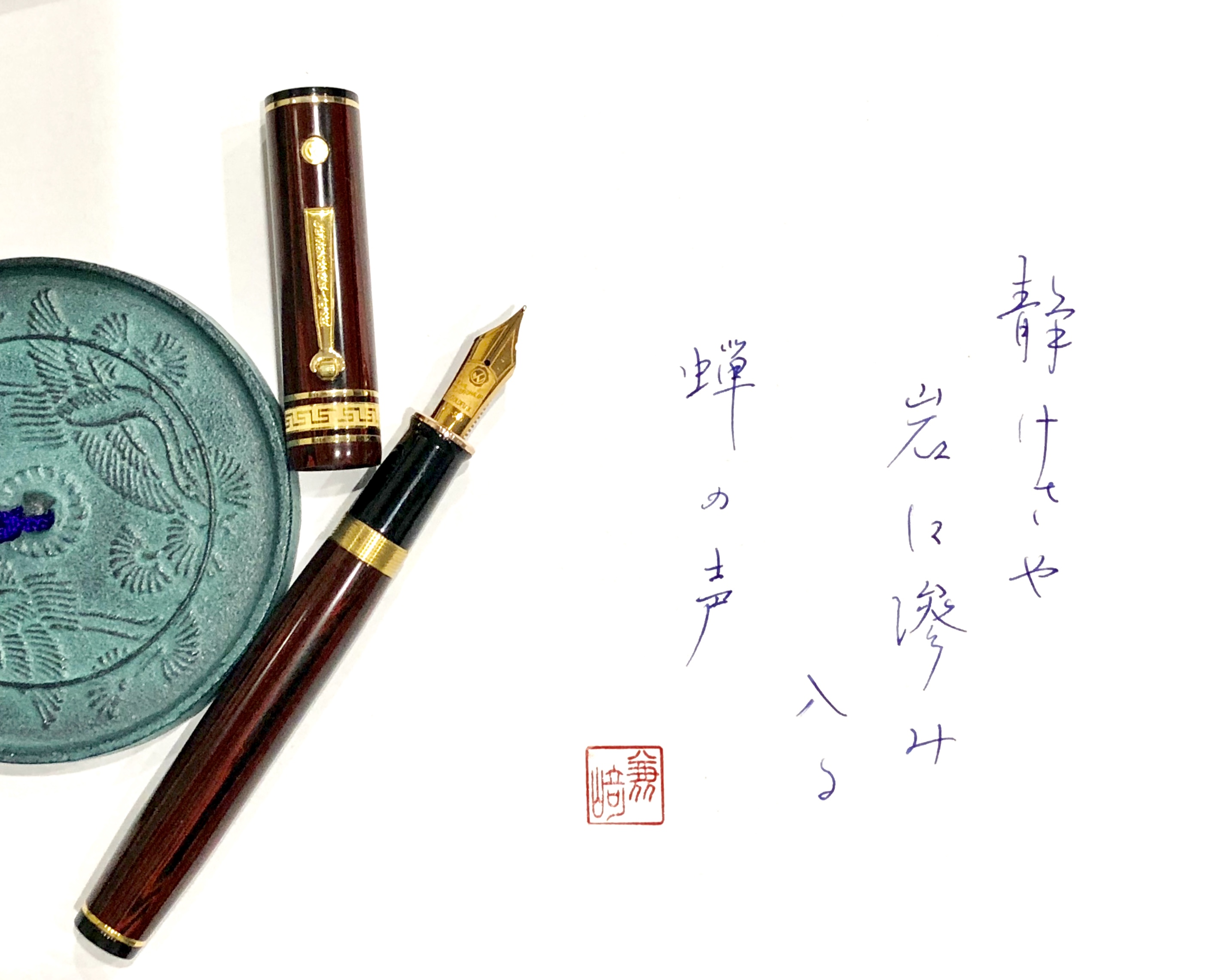
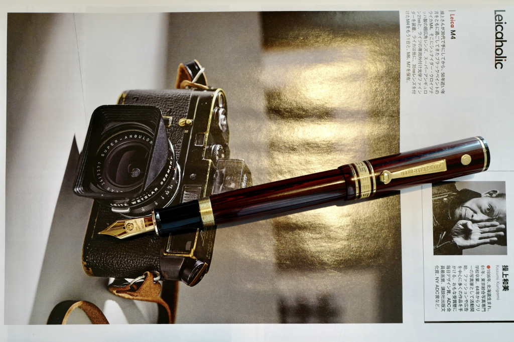
The cap of the pen is flat-topped with a thin finial of black ebonite and a thin gold ring. The Wahl-Eversharp gold seal is inlaid in the wall of the cap right above the (small for the pen's size) roller clip. The clip is flexy, and attaches to the cap through a small slit cut in the cap's wall. The cap tapers down slightly to three gold bands: two thin, and one wider band with a Greek key design etched into the surface.
The barrel of the pen keeps a cylindrical shape until it tapers slightly at the end toward another gold band and the pnuematic filler knob.
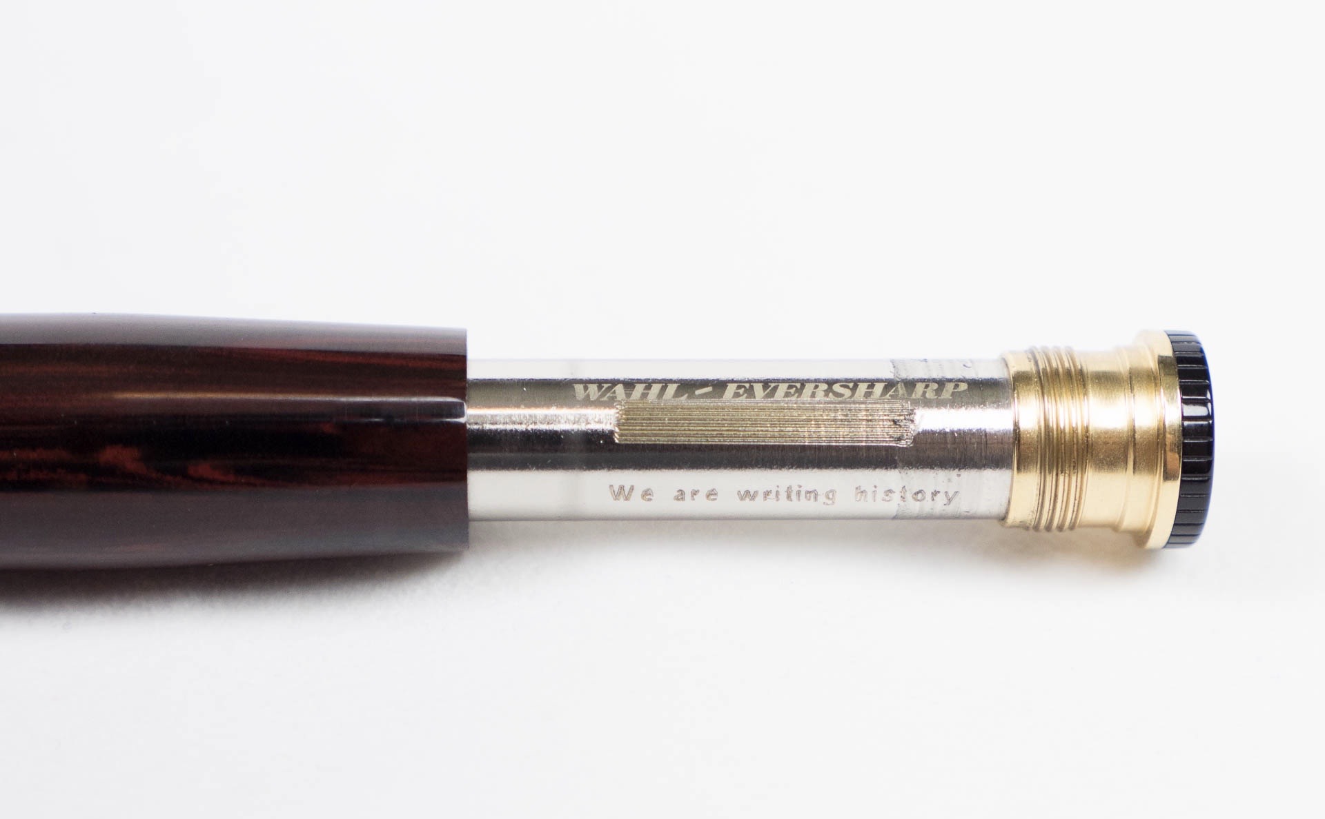
This is my first pneumatically-filled pens. To fill the pen, you unscrew the filler knob and pull out the knob to expose a metal sleeve. You insert the nib and a bit of the section in the ink, then cover the hole in the filler knob with your finger and push down. This action causes an increase of air pressure in the barrel of the pen, which compresses the ink sac inside. When you uncover the hole in the knob, the excess air pressure escapes, the compressed ink sac uncompresses, and the sac sucks ink up through the feed. I don't have an exact measurement for the ink capacity, but Syd assured me that it can hold a fair bit. Considering how large the barrel of this pen is, I'm wouldn't be surprised if the Decoband utilizes the largest possible ink sac made for fountain pens.
The cap unscrews from the barrel with 1.5 turns, and reveals gold metal threads, a black ebonite section, and the stunning "Superflex" nib. The metal threads of the barrel mesh with the ebonite threads of the cap smoothly, and with no resistance. This is not really a shirt-pocket pen, but I could see these threads being so smooth that the cap might come loose with a lot of jostling. The chunky ebonite section is large, and tapers toward a lip at the bottom. The section terminates with one more very narrow gold band. It's an exceptionally comfortable section in my hand.
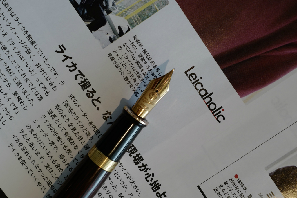
As mentioned, the nib is huge. Aside from its larger overall profile, the tines feel long and narrow as one might expect for a flexible nibThe nib is stamped with "14K-585," but the most impressive decoration is the laser engraving which removes surface material from the nib. Nib material is removed in such a way to leave behind a bas relief Wahl-Eversharp Seal, and the words "Wahl-Eversharp Superflex." One of the other fun benefits of the laser etching is that the ink in the pen will occassionally settle and spread across the etched surface, making the gold of the nib look almost like colored, anodized aluminum. It's a cool effect. I don't know how easily that will clean off, but I have to suspect that the gold probably won't stain.
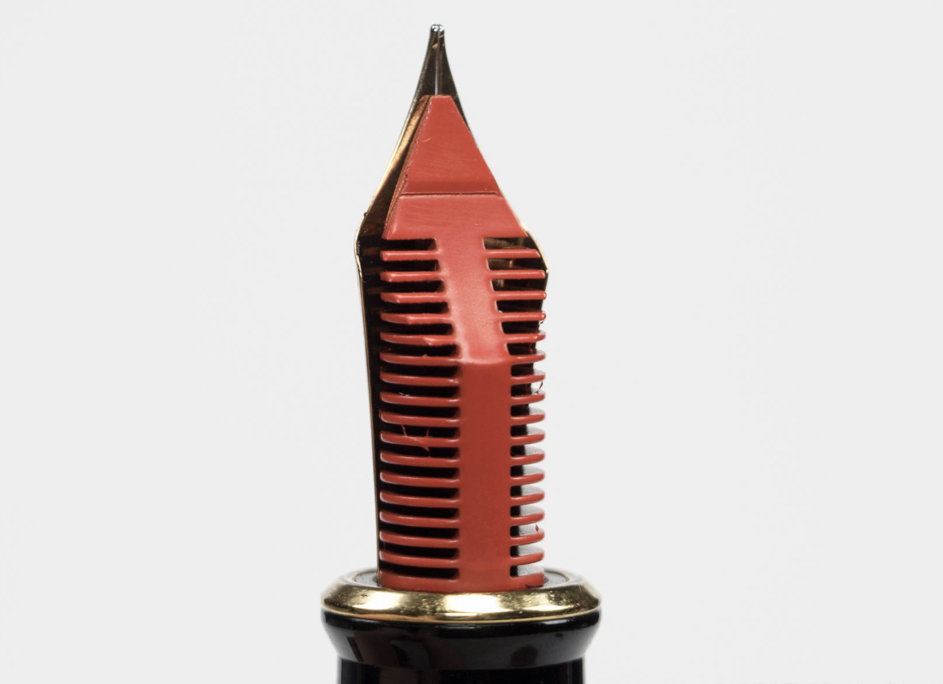
On the underside of the massive nib is an equally massive ebonite feed: it's bright red. The red is not the color of the ebonite, but rather, a coating of red urushi lacquer that is applied to the feed to help improve ink flow. It reminds me of the red sole on a pair of expensive Louboutins.
This pen just oozes refinement. The fit and finish of the pen from top to bottom is absolutely superb. The new Wahl-Eversharp has (wisely, in my opinion) decided to enter the market as a luxury brand, and put out top-of-the-line products. The attention to detail is evident. (It is always easier to start out as a high-end manufacturer and move downscale than it is to do the reverse.) Plus it shows that the founders of the modern Wahl-Eversharp are interested in helping to maintain the brand's good name...all points in the plus column for me.
I do have a minor quibble with this pen, however: It's really, really big. I know that they were trying to keep the dimensions proportional to the original, but it feels like they went just a touch overboard. Despite its monstrous size, this pen is incredibly comfortable in the hand. It is a heavy pen at 44 grams uncapped, but that extra heft ends up making the pen just snuggle down into my grip like it belongs there. Which, to be fair, it does! The section is a little too wide, but for some reason, the diameter doesn't bother me as much as other sections of the same size have. I think the tapered quality of the section gives it better ergonomics compared to more cylindrical sections of pens like the Montblanc 149 or the Delta Dolcevita Oversize.
So, then we come to what most people are really interested in: does the "Superflex" nib live up to its name? For the most part, I am happy to report that it does. When not flexing, the nib is beautifully smooth, juicy, and with a lovely little bounce. It is, without question, the smoothest writing experience I've ever had with a flex nib. The nib slit, out of the box, was a touch wide toward the tip of the nib, which along with the nib's wetness, resulted in a line a little too "medium" for my tastes. (I like my flex to have a nice, fine line when not flexing.) I did close up the tines just a touch. Even without that minor alteration, it behaved perfectly for me: no hard starts, no skipping, no ink starvation.
On flex writing, this is easily the best modern flex I've ever used. Wahl-Eversharp has almost solved the ink flow issues with flex nibs. I initially had some issues with railroading, but I realized that I was rotating the pen in my hand (and going a bit too fast.) Once I got my grip right and slowed down a bit, I didn't run into any issues with railroading on my flex writing. You do have to be careful not to push the nib too far. This is not a wet noodle with 2mm line variation, but it can still get really good flex. The feel is quite similar to the medium flex nib that I've gone on my vintage Waterman's Ideal #7. It lacks perhaps a touch of the snappy return you get with the vintage nibs, but the nib gives really good tactile feedback when you get close to pushing the flex too far. It's easy to tell when you can go a bit further or you've gone too far on your flexing.
I love this pen. I initially thought it was going to be too big, but the more I write with it, the more perfect it feels in my hand. I like writing with this pen while I'm flex-writing. Aside from that, though, I find myself reaching for this pen for everything I write. I love the way that the heft of the pen helps to introduce a bit of a bounce to the writing, even when I'm not trying to flex. I love the generous ink flow. I love the rosewood ebonite, and the way it warms up in my hand over time.
I haven't had a ton of time with this pen, so I will probably do a quick follow up review in a couple of months when I've had more time to get used to it. But so far, this is one of the best pens in my collection. I think the new Wahl-Eversharp did this one up right.
敢えて付け加えるとすれば、この万年筆にはMとかFの文字幅がない。使う人の好みに合わせることが前提のようだ。なお、ペン先が14金だったのは、初期の頃で今は18金になっている。
私が贔屓にしている神戸の万年筆店"Pen and message"が日本で唯一のウォールエバーシャープの公認販売店になったのは、2017年の年末の頃だ。 それから何度か店を訪れるたびに、このデコバンドが気になっていた。長年続けてきた万年筆のコレクションもそろそろ終わりにしようと思っていたところだったので、すぐには購入しなかった。ひょいと買える値段でもなかった。これが最後と思いながらもまだ何本か買っていたので、多分手は出ないだろうと思っていた。
しかし、試筆もしていないこの万年筆がどうしても心から消えることがなかったのは、その形の美しさ故にだった。2019年7月19日に意を決してペンアンドメッセージを訪問した。書き心地が悪ければ買わないことを前提にして、これだけは自分でも譲らない絶対条件に試筆する。 モンブラン 149より太くて長い。これはどうかなと思いながら文字を書いてみると驚いたことに、手の中でペン軸が安定しニブの柔らかさと相まって、書きやすいという思いを通り越して、何年も使って手に馴染んだ書き心地だった。
上皇后様御製
平成四年一月十四日
お題 風
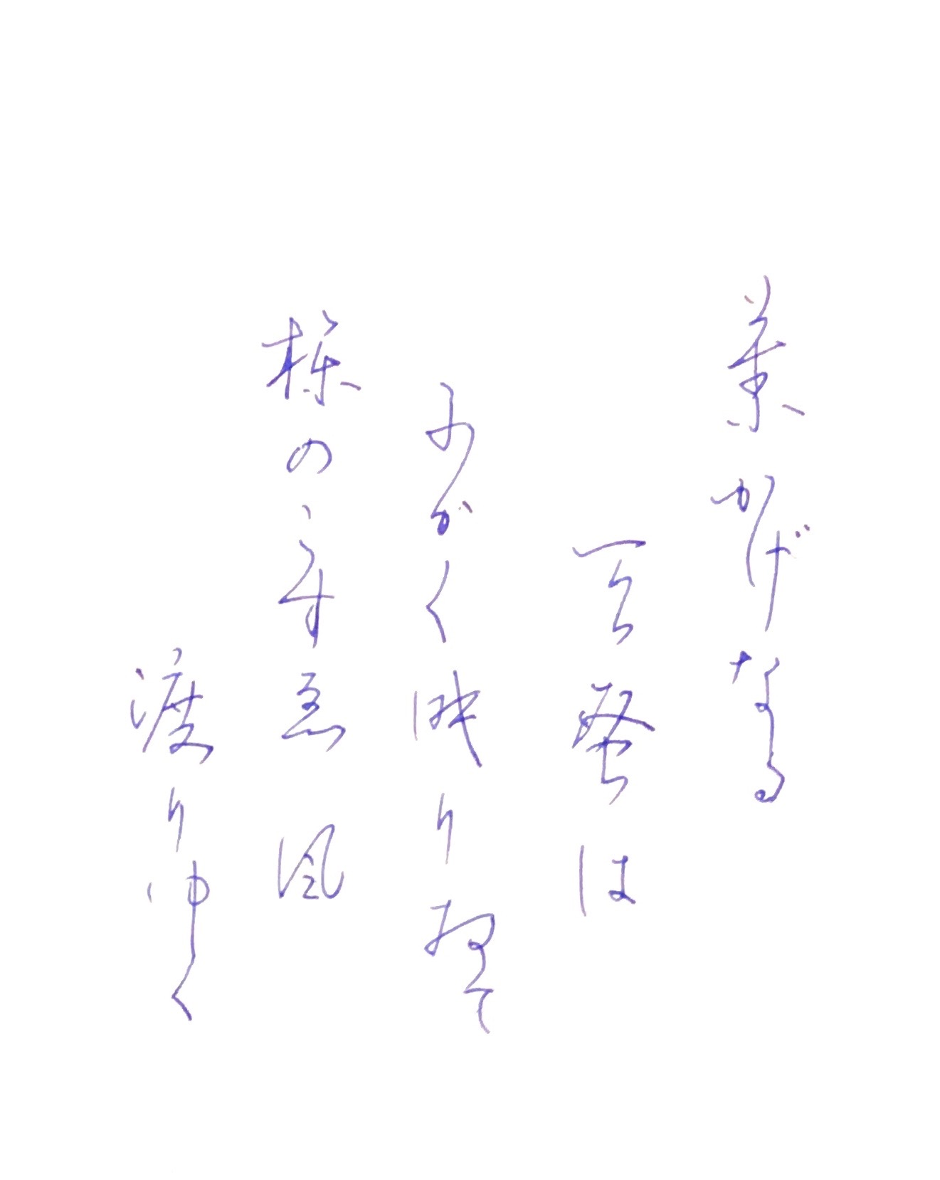
御製 葉かげなる天蚕(テンサン)はふかく眠りゐて 櫟(クヌギ)のこずゑ風渡りゆく
これは欲しいと思った。これほど欲しいと思って買った万年筆は今までに数本だ。素晴らしい万年筆だ。フィードが二重構造になっていることや、空気圧でインクを吸い込む機構などの説明をしてもらって、早速インクを入れて貰った。驚いたのは、収納用の箱だ。ピアノブラックの大きな箱は片手では持てない立派さで、パーカーのデュオフォールド限定盤が入っていた箱より立派で美しい。泊まっていたホテルに帰って、その書き心地に惚れぼれしながら、長い時間文字を書き続けた。このホームページで紹介してきた万年筆たちの中でも5本の指に入る大好きな万年筆だ。
In 2013, Syd Saperstein and Emmanuel Caltagirone re-released the brand under the Wahl-Eversharp name. Syd, a long time W-E collector (often known as "The Wahlnut") had a deep understanding of what made W-E pens special, and so went about trying to recreate more than just the name, but rather, many of the design and aesthetic aspects of the pen. The new Wahl-Eversharp skyline is a near-exact duplicate of the original. And, at the DC Show in August, the new Wahl-Eversharp announced their newly released Decoband.
The 2015 Decoband, released by Wahl-Eversharp this December, is a massive pen. It belongs to W-E's "Gold Seal Oversize" collection. Despite its size, however, it is proportionally identical to the original Decoband (meaning that, although the new pen is bigger, all the proportions of the new pen are equally scaled up from the proportions of the old pen.) The Decoband comes in three colors: Rosewood Ebonite, Black Ebonite, and Lapis Blue Marble Acrylic Resin. There is also a demonstrator version out there that was made for, well, demonstration purposes. It, however, is not publically available at this time. There were limited numbers of these created in the first run (I believe I remember the number 75 per color).
One of the other things that makes this reissue of the Decoband special is the nib that Syd and company decided to include on this new pen. W-E worked closely with their nib manufacturer to come up with a huge #8-sized nib that they are calling the "Superflex" nib. It's 14k gold, for which a new alloy was developed to help replicate flex nibs on vintage pens. The face of the nib is also laser-etched to thin out the material and provide some extra line variation.
At the DC Show, I pre-ordered the Rosewood Decoband. It arrives in a massive piano-black lacquered case with the Wahl-Eversharp logo inlaid on the lid. Opening the case shows the pen, a brochure, and box of Wahl-Eversharp ink. The case it beautifully made...the kind of case you might want to leave sitting out on the desk. While I probably won't use the case to store my pen, I may see if the interior lining is removable, because it is large enough to serve as a great place to store inks, sample vials, repair materials, or other pen-aphernalia.
The pen itself is stunning. The rosewood ebonite from which it is made is finely figured with delicate threads of red and black ripples that, from a distance, really do give the appearance of wood grain. The ebonite is polished to an absolute mirror finish. It's one of the nicest polishes I've ever seen on an ebonite pen.
The cap of the pen is flat-topped with a thin finial of black ebonite and a thin gold ring. The Wahl-Eversharp gold seal is inlaid in the wall of the cap right above the (small for the pen's size) roller clip. The clip is flexy, and attaches to the cap through a small slit cut in the cap's wall. The cap tapers down slightly to three gold bands: two thin, and one wider band with a Greek key design etched into the surface.
The barrel of the pen keeps a cylindrical shape until it tapers slightly at the end toward another gold band and the pnuematic filler knob.
This is my first pneumatically-filled pens. To fill the pen, you unscrew the filler knob and pull out the knob to expose a metal sleeve. You insert the nib and a bit of the section in the ink, then cover the hole in the filler knob with your finger and push down. This action causes an increase of air pressure in the barrel of the pen, which compresses the ink sac inside. When you uncover the hole in the knob, the excess air pressure escapes, the compressed ink sac uncompresses, and the sac sucks ink up through the feed. I don't have an exact measurement for the ink capacity, but Syd assured me that it can hold a fair bit. Considering how large the barrel of this pen is, I'm wouldn't be surprised if the Decoband utilizes the largest possible ink sac made for fountain pens.
The cap unscrews from the barrel with 1.5 turns, and reveals gold metal threads, a black ebonite section, and the stunning "Superflex" nib. The metal threads of the barrel mesh with the ebonite threads of the cap smoothly, and with no resistance. This is not really a shirt-pocket pen, but I could see these threads being so smooth that the cap might come loose with a lot of jostling. The chunky ebonite section is large, and tapers toward a lip at the bottom. The section terminates with one more very narrow gold band. It's an exceptionally comfortable section in my hand.
As mentioned, the nib is huge. Aside from its larger overall profile, the tines feel long and narrow as one might expect for a flexible nibThe nib is stamped with "14K-585," but the most impressive decoration is the laser engraving which removes surface material from the nib. Nib material is removed in such a way to leave behind a bas relief Wahl-Eversharp Seal, and the words "Wahl-Eversharp Superflex." One of the other fun benefits of the laser etching is that the ink in the pen will occassionally settle and spread across the etched surface, making the gold of the nib look almost like colored, anodized aluminum. It's a cool effect. I don't know how easily that will clean off, but I have to suspect that the gold probably won't stain.
On the underside of the massive nib is an equally massive ebonite feed: it's bright red. The red is not the color of the ebonite, but rather, a coating of red urushi lacquer that is applied to the feed to help improve ink flow. It reminds me of the red sole on a pair of expensive Louboutins.
This pen just oozes refinement. The fit and finish of the pen from top to bottom is absolutely superb. The new Wahl-Eversharp has (wisely, in my opinion) decided to enter the market as a luxury brand, and put out top-of-the-line products. The attention to detail is evident. (It is always easier to start out as a high-end manufacturer and move downscale than it is to do the reverse.) Plus it shows that the founders of the modern Wahl-Eversharp are interested in helping to maintain the brand's good name...all points in the plus column for me.
I do have a minor quibble with this pen, however: It's really, really big. I know that they were trying to keep the dimensions proportional to the original, but it feels like they went just a touch overboard. Despite its monstrous size, this pen is incredibly comfortable in the hand. It is a heavy pen at 44 grams uncapped, but that extra heft ends up making the pen just snuggle down into my grip like it belongs there. Which, to be fair, it does! The section is a little too wide, but for some reason, the diameter doesn't bother me as much as other sections of the same size have. I think the tapered quality of the section gives it better ergonomics compared to more cylindrical sections of pens like the Montblanc 149 or the Delta Dolcevita Oversize.
So, then we come to what most people are really interested in: does the "Superflex" nib live up to its name? For the most part, I am happy to report that it does. When not flexing, the nib is beautifully smooth, juicy, and with a lovely little bounce. It is, without question, the smoothest writing experience I've ever had with a flex nib. The nib slit, out of the box, was a touch wide toward the tip of the nib, which along with the nib's wetness, resulted in a line a little too "medium" for my tastes. (I like my flex to have a nice, fine line when not flexing.) I did close up the tines just a touch. Even without that minor alteration, it behaved perfectly for me: no hard starts, no skipping, no ink starvation.
On flex writing, this is easily the best modern flex I've ever used. Wahl-Eversharp has almost solved the ink flow issues with flex nibs. I initially had some issues with railroading, but I realized that I was rotating the pen in my hand (and going a bit too fast.) Once I got my grip right and slowed down a bit, I didn't run into any issues with railroading on my flex writing. You do have to be careful not to push the nib too far. This is not a wet noodle with 2mm line variation, but it can still get really good flex. The feel is quite similar to the medium flex nib that I've gone on my vintage Waterman's Ideal #7. It lacks perhaps a touch of the snappy return you get with the vintage nibs, but the nib gives really good tactile feedback when you get close to pushing the flex too far. It's easy to tell when you can go a bit further or you've gone too far on your flexing.
I love this pen. I initially thought it was going to be too big, but the more I write with it, the more perfect it feels in my hand. I like writing with this pen while I'm flex-writing. Aside from that, though, I find myself reaching for this pen for everything I write. I love the way that the heft of the pen helps to introduce a bit of a bounce to the writing, even when I'm not trying to flex. I love the generous ink flow. I love the rosewood ebonite, and the way it warms up in my hand over time.
I haven't had a ton of time with this pen, so I will probably do a quick follow up review in a couple of months when I've had more time to get used to it. But so far, this is one of the best pens in my collection. I think the new Wahl-Eversharp did this one up right.
- 購入について -
万年筆のレビューについては、上記のPEN HABITの主人マット氏が適確に書かれているので、それを参考にして欲しい。ここでは、私がこの万年筆を手に入れた時のエピソードを書くことにする。敢えて付け加えるとすれば、この万年筆にはMとかFの文字幅がない。使う人の好みに合わせることが前提のようだ。なお、ペン先が14金だったのは、初期の頃で今は18金になっている。
私が贔屓にしている神戸の万年筆店"Pen and message"が日本で唯一のウォールエバーシャープの公認販売店になったのは、2017年の年末の頃だ。 それから何度か店を訪れるたびに、このデコバンドが気になっていた。長年続けてきた万年筆のコレクションもそろそろ終わりにしようと思っていたところだったので、すぐには購入しなかった。ひょいと買える値段でもなかった。これが最後と思いながらもまだ何本か買っていたので、多分手は出ないだろうと思っていた。
しかし、試筆もしていないこの万年筆がどうしても心から消えることがなかったのは、その形の美しさ故にだった。2019年7月19日に意を決してペンアンドメッセージを訪問した。書き心地が悪ければ買わないことを前提にして、これだけは自分でも譲らない絶対条件に試筆する。 モンブラン 149より太くて長い。これはどうかなと思いながら文字を書いてみると驚いたことに、手の中でペン軸が安定しニブの柔らかさと相まって、書きやすいという思いを通り越して、何年も使って手に馴染んだ書き心地だった。
上皇后様御製
平成四年一月十四日
お題 風
御製 葉かげなる天蚕(テンサン)はふかく眠りゐて 櫟(クヌギ)のこずゑ風渡りゆく
これは欲しいと思った。これほど欲しいと思って買った万年筆は今までに数本だ。素晴らしい万年筆だ。フィードが二重構造になっていることや、空気圧でインクを吸い込む機構などの説明をしてもらって、早速インクを入れて貰った。驚いたのは、収納用の箱だ。ピアノブラックの大きな箱は片手では持てない立派さで、パーカーのデュオフォールド限定盤が入っていた箱より立派で美しい。泊まっていたホテルに帰って、その書き心地に惚れぼれしながら、長い時間文字を書き続けた。このホームページで紹介してきた万年筆たちの中でも5本の指に入る大好きな万年筆だ。
■ ペン先 : 14金 / 文字幅 : 指定なし
■ 機構 : 空気圧吸入式 / チューブ使用
■ 仕様 : エボナイト $ ゴールドトリム
■ 長さ : 約149.6mm(収納時) / 約193.8mm(キャップ装着)
■ 長さ : 約142.8(筆記時・キャップなし)
■ 軸径最大: 約15mmφ
■ キャップ径 : 最大:約18mmφ (クリップを除く)
■ 重さ : 約44g ( キャップを除く) 約58g ( キャップを含む)
■ 機構 : 空気圧吸入式 / チューブ使用
■ 仕様 : エボナイト $ ゴールドトリム
■ 長さ : 約149.6mm(収納時) / 約193.8mm(キャップ装着)
■ 長さ : 約142.8(筆記時・キャップなし)
■ 軸径最大: 約15mmφ
■ キャップ径 : 最大:約18mmφ (クリップを除く)
■ 重さ : 約44g ( キャップを除く) 約58g ( キャップを含む)


